Cordis
Cordis is an R&D project exploring how heart-rate data could become part of music, motion, storytelling and visual identity. The project uses biometric input as a creative material, testing how a person’s pulse might influence sound, rhythm, colour, movement and atmosphere.
The work exists as a playable prototype, but the broader interest is in what this kind of data could become. Heart rate, recovery, sleep, movement and training are usually translated into graphs, scores and dashboards. Cordis asks whether those signals could also become something more emotional: a way to shape a piece of music, shift the mood of a visual system, or become part of a wider design language.
Each pulse can trigger notes from an acoustic piano recorded at home, while also affecting the behaviour of the visuals. Some experiments explore colour as a biometric signal, with lower heart-rate zones moving through cooler blues and greens, and higher zones shifting toward warmer oranges and reds.
The project also points toward more speculative ideas around music, presence and responsive identity systems: an album that unfolds through your own heart-rate data, a shared composition shaped by two bodies in different places, or a brand world that behaves less like a fixed set of assets and more like something people help activate.
The visual language draws from medical imagery, ultrasound scans, cardiac imaging and colour Doppler systems. These references are built for clarity and diagnosis rather than expression, which gives them a strange kind of sincerity. Cordis is informed by that accidental beauty, reworking it into a softer and more emotional audio-visual language.
Cordis is not a finished product or health tool. It is a working sketch, a way of testing how biological data might be used to tell stories, shape interaction and become part of a responsive design system.
The work exists as a playable prototype, but the broader interest is in what this kind of data could become. Heart rate, recovery, sleep, movement and training are usually translated into graphs, scores and dashboards. Cordis asks whether those signals could also become something more emotional: a way to shape a piece of music, shift the mood of a visual system, or become part of a wider design language.
Each pulse can trigger notes from an acoustic piano recorded at home, while also affecting the behaviour of the visuals. Some experiments explore colour as a biometric signal, with lower heart-rate zones moving through cooler blues and greens, and higher zones shifting toward warmer oranges and reds.
The project also points toward more speculative ideas around music, presence and responsive identity systems: an album that unfolds through your own heart-rate data, a shared composition shaped by two bodies in different places, or a brand world that behaves less like a fixed set of assets and more like something people help activate.
The visual language draws from medical imagery, ultrasound scans, cardiac imaging and colour Doppler systems. These references are built for clarity and diagnosis rather than expression, which gives them a strange kind of sincerity. Cordis is informed by that accidental beauty, reworking it into a softer and more emotional audio-visual language.
Cordis is not a finished product or health tool. It is a working sketch, a way of testing how biological data might be used to tell stories, shape interaction and become part of a responsive design system.
Key deliverables
R&D prototype
Interactive system
Biometric interaction
Audio system
Generative visual system
Motion design
R&D prototype
Interactive system
Biometric interaction
Audio system
Generative visual system
Motion design

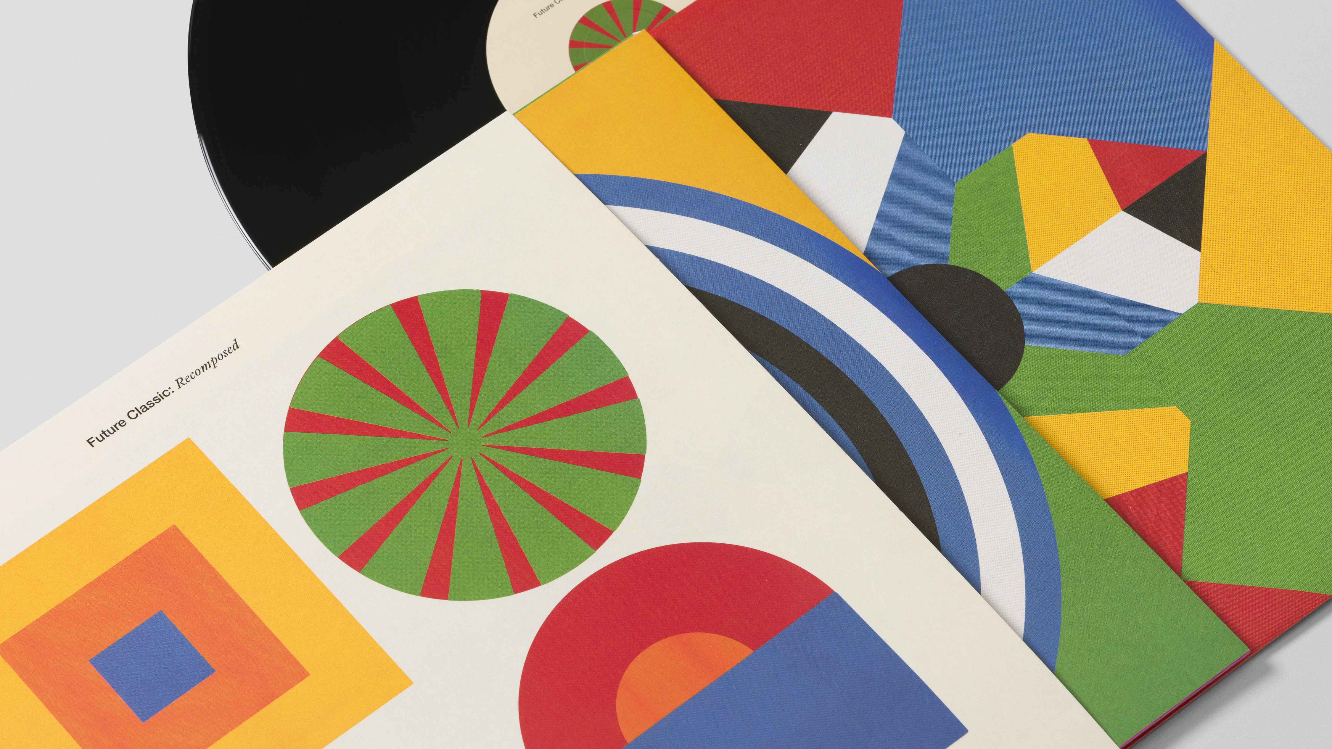


Future Classic: Recomposed
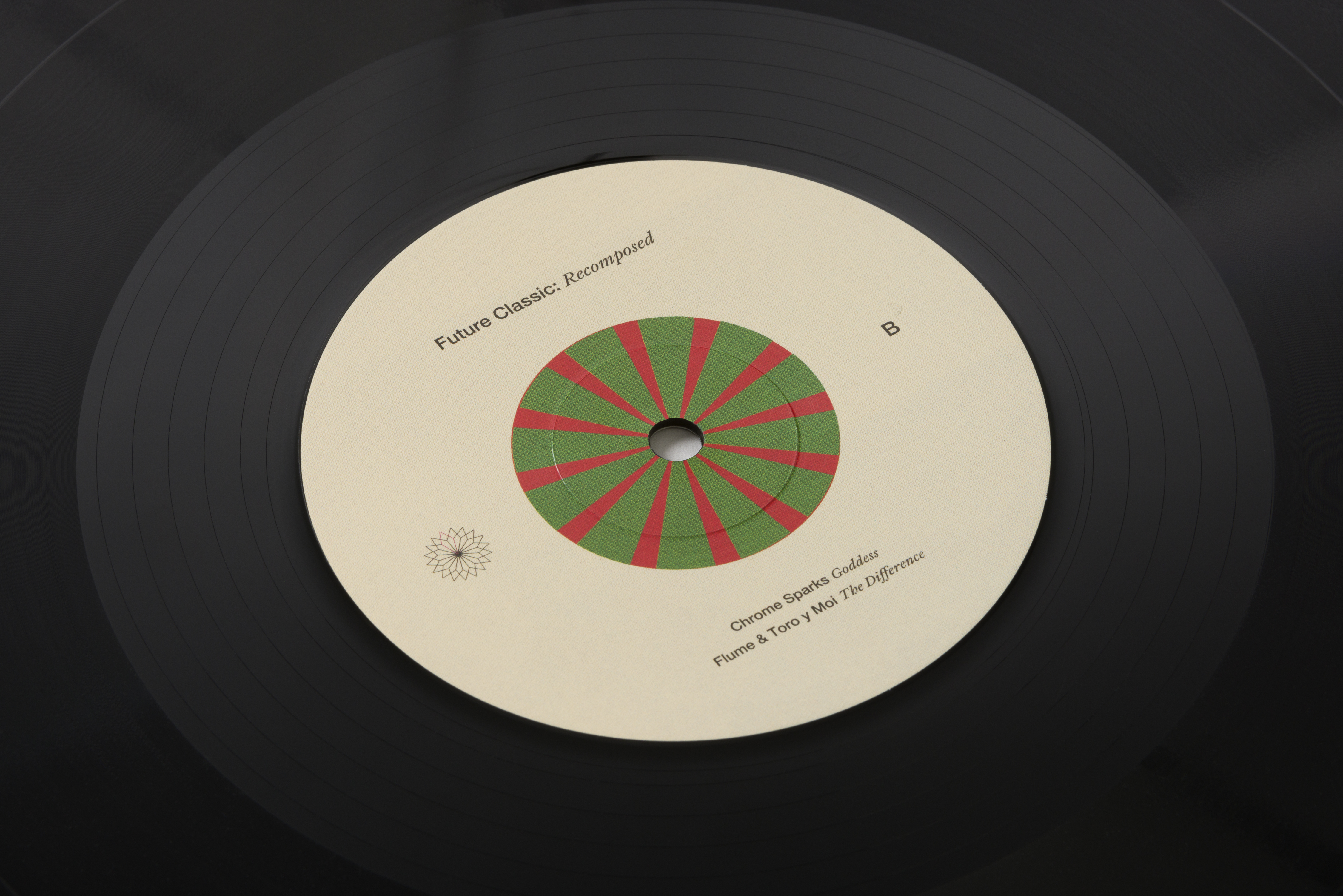
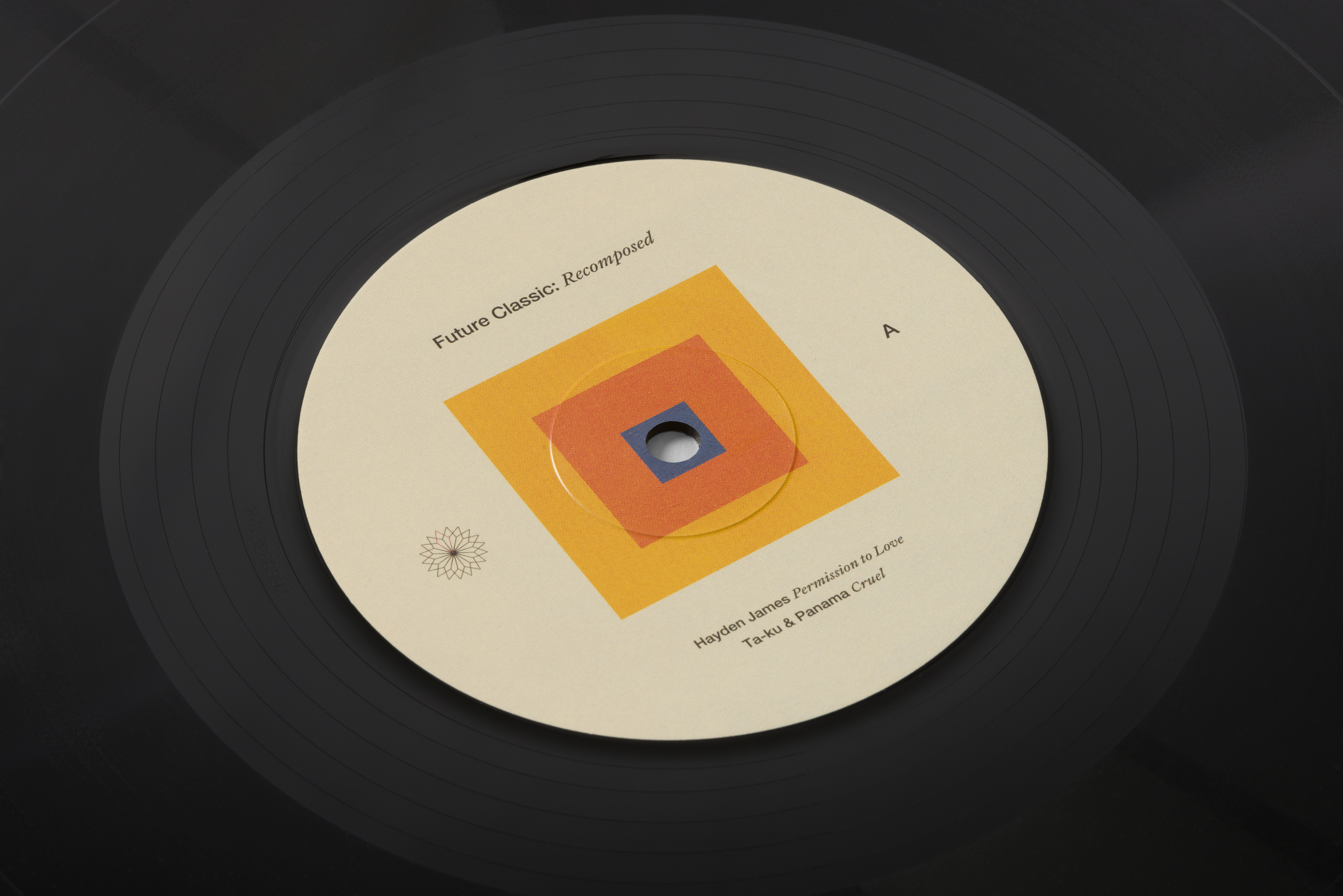
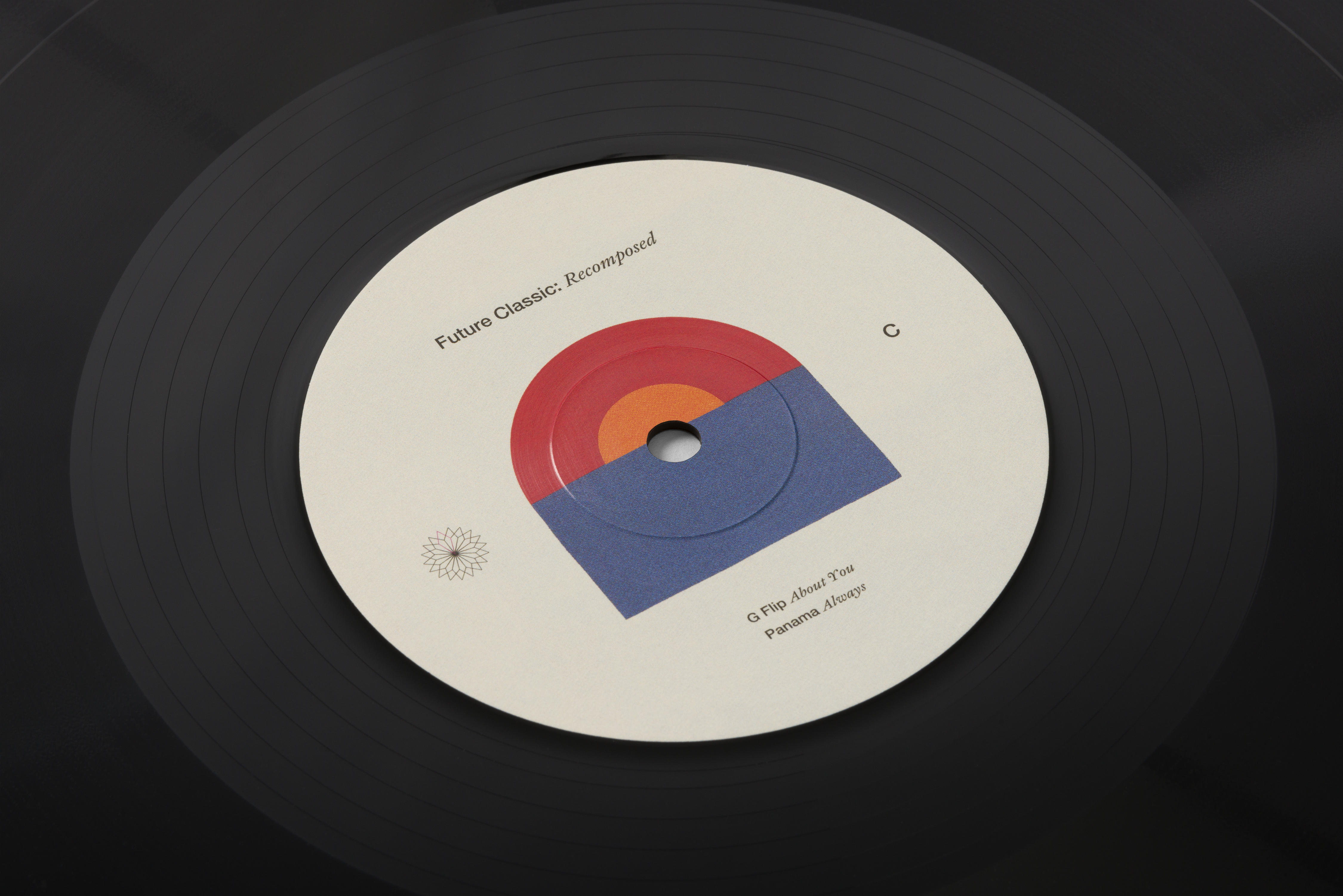
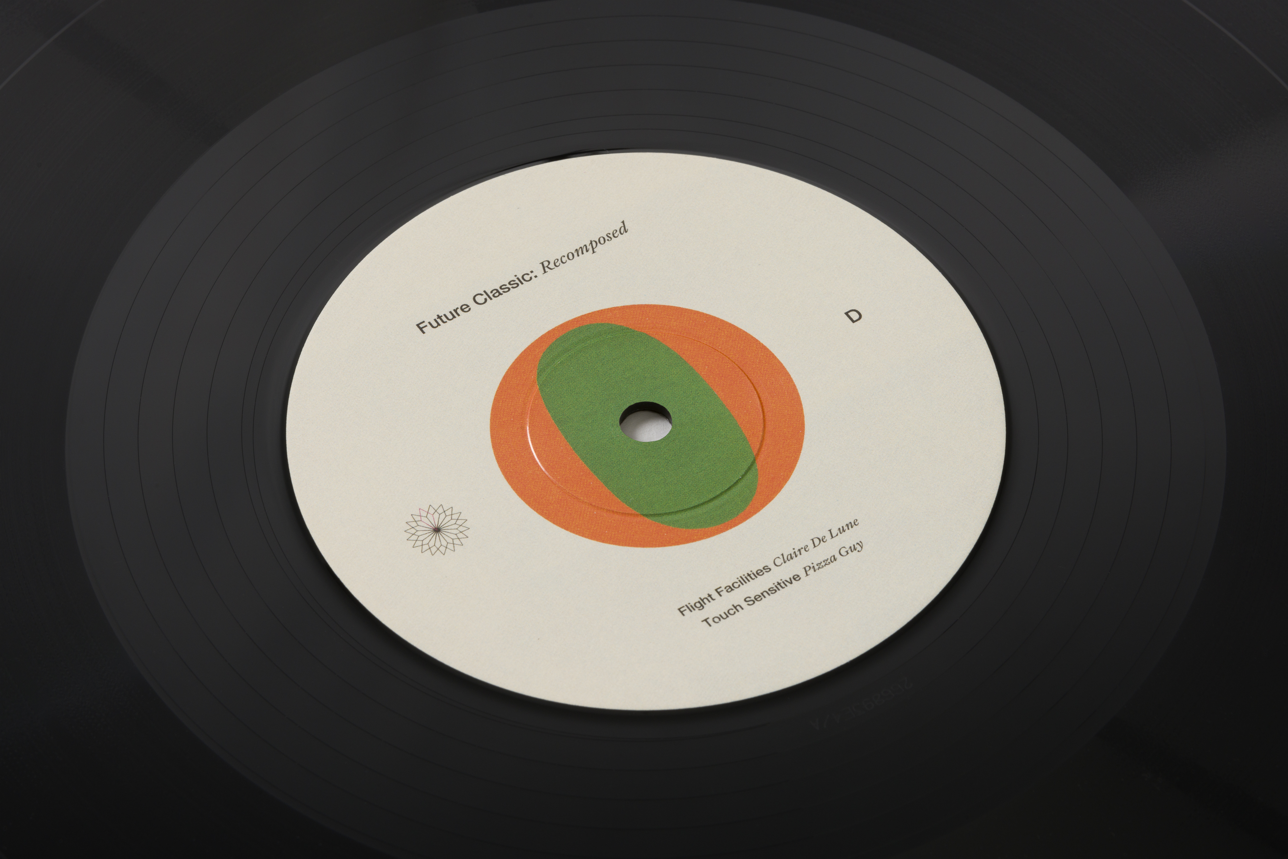
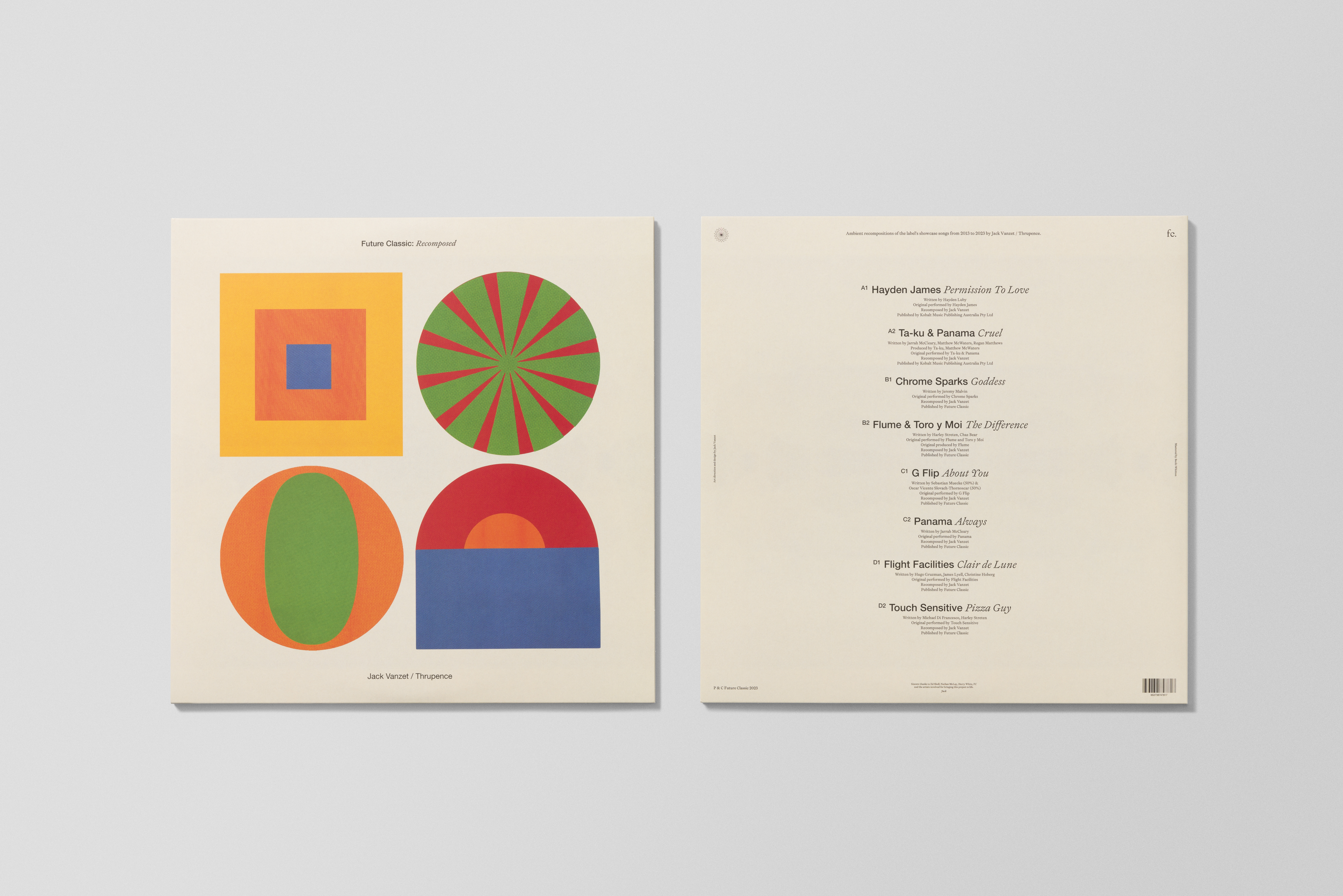
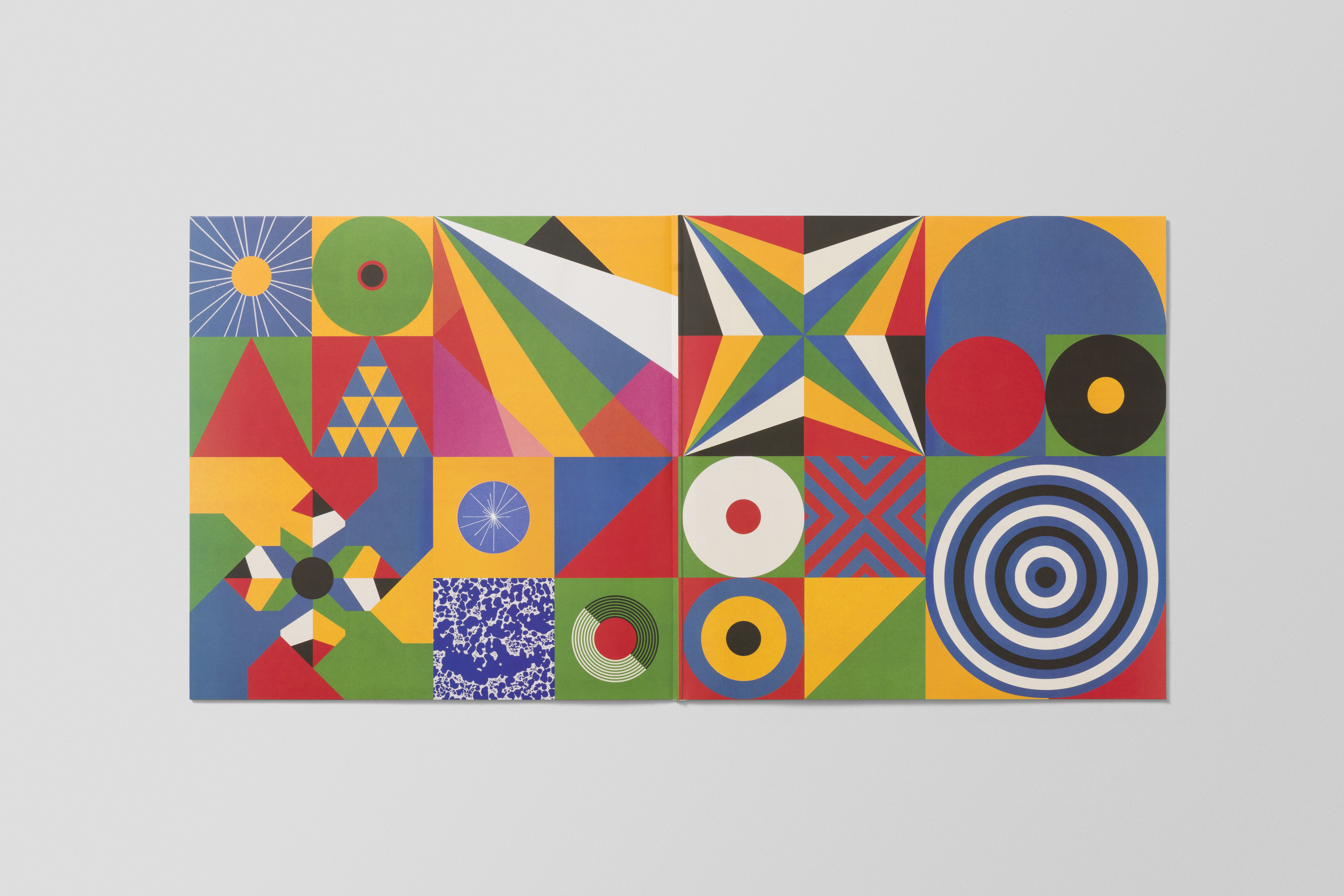
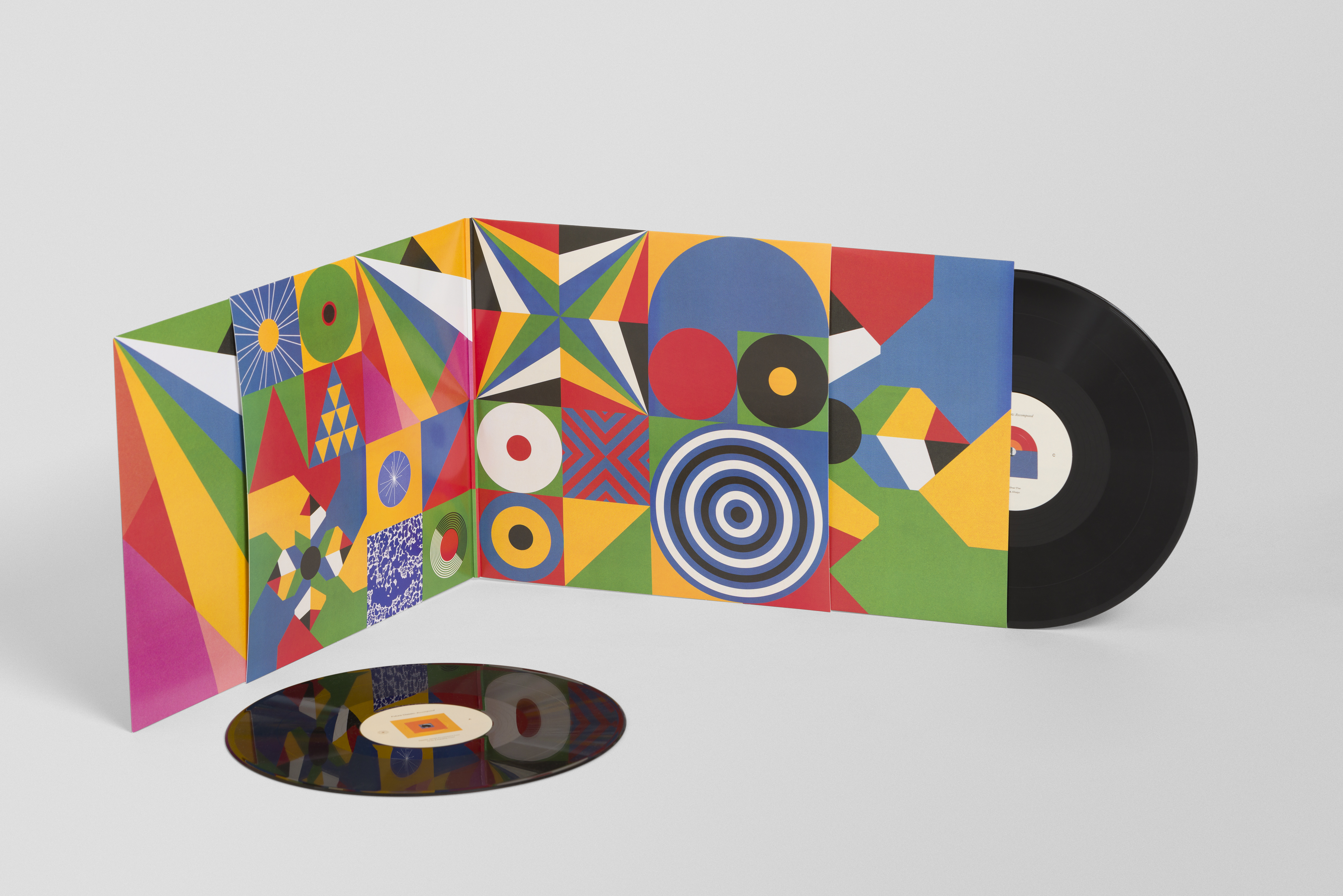
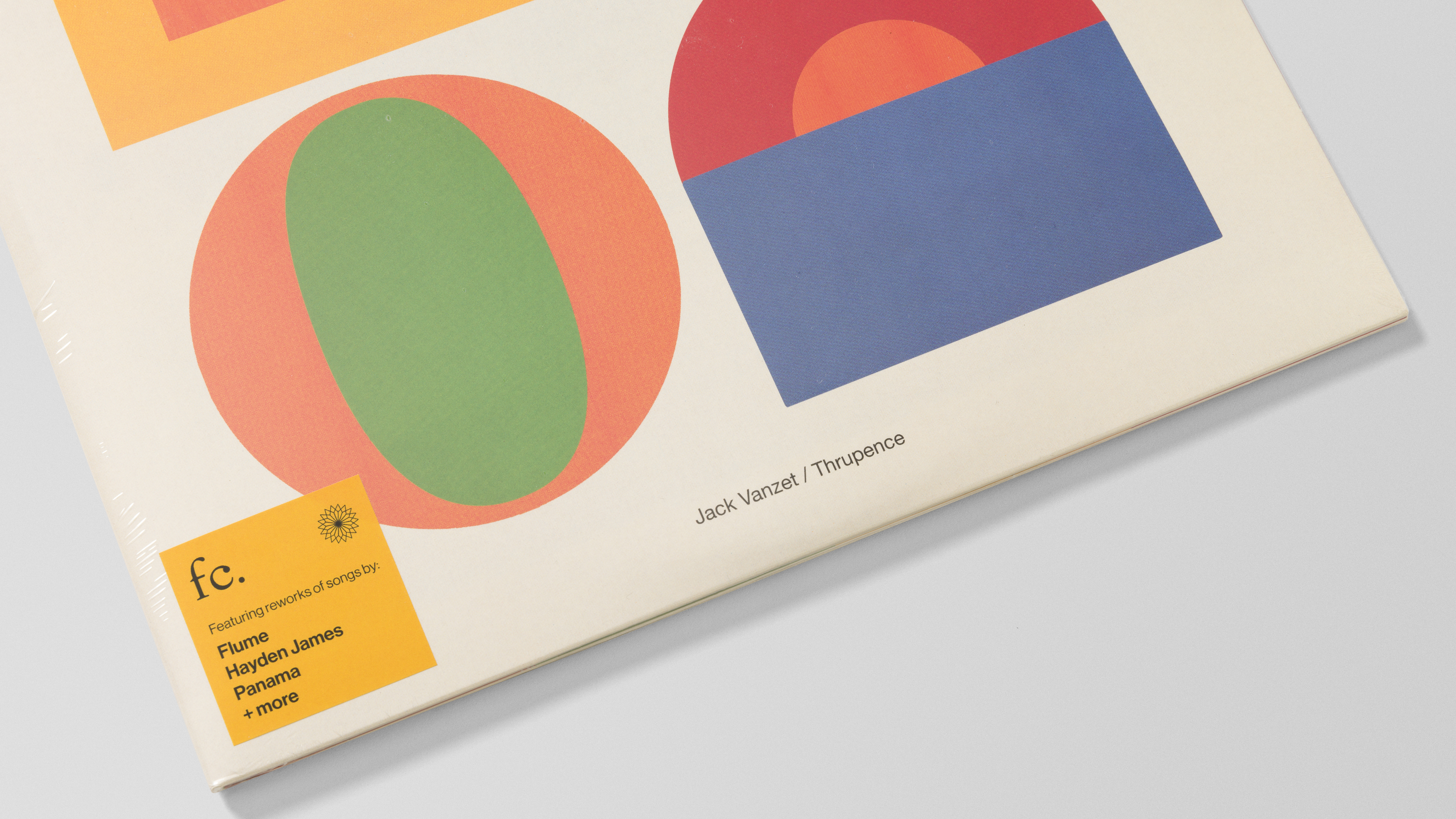
Future Classic: Recomposed is an audio-visual project for Future Classic, the award-winning independent music label, artist management team and touring agency with offices in Sydney and Los Angeles. The project reimagines eight standout songs from the label’s catalogue as ambient and classical compositions, spanning still and motion, social and brand applications, and a collectible double gatefold vinyl with printed inner sleeves.
A key challenge was making Recomposed feel open and accessible beyond traditional classical or ambient audiences. It was designed to sit comfortably across different contexts, from focused listening and meditation to quieter, more everyday moments at home. The visual system reflects that same sense of invitation, creating a world that feels calm, tactile and considered without becoming exclusive or overly precious.
Buy vinyl here ︎︎︎
Listen here ︎︎︎
A key challenge was making Recomposed feel open and accessible beyond traditional classical or ambient audiences. It was designed to sit comfortably across different contexts, from focused listening and meditation to quieter, more everyday moments at home. The visual system reflects that same sense of invitation, creating a world that feels calm, tactile and considered without becoming exclusive or overly precious.
Buy vinyl here ︎︎︎
Listen here ︎︎︎
Key deliverables
Visual identity + creative direction
Motion language + animation design
Campaign design
Gatefold vinyl packaging
Music production
Mastered by Becki Whitton
Visual identity + creative direction
Motion language + animation design
Campaign design
Gatefold vinyl packaging
Music production
Mastered by Becki Whitton

Josh Hooke
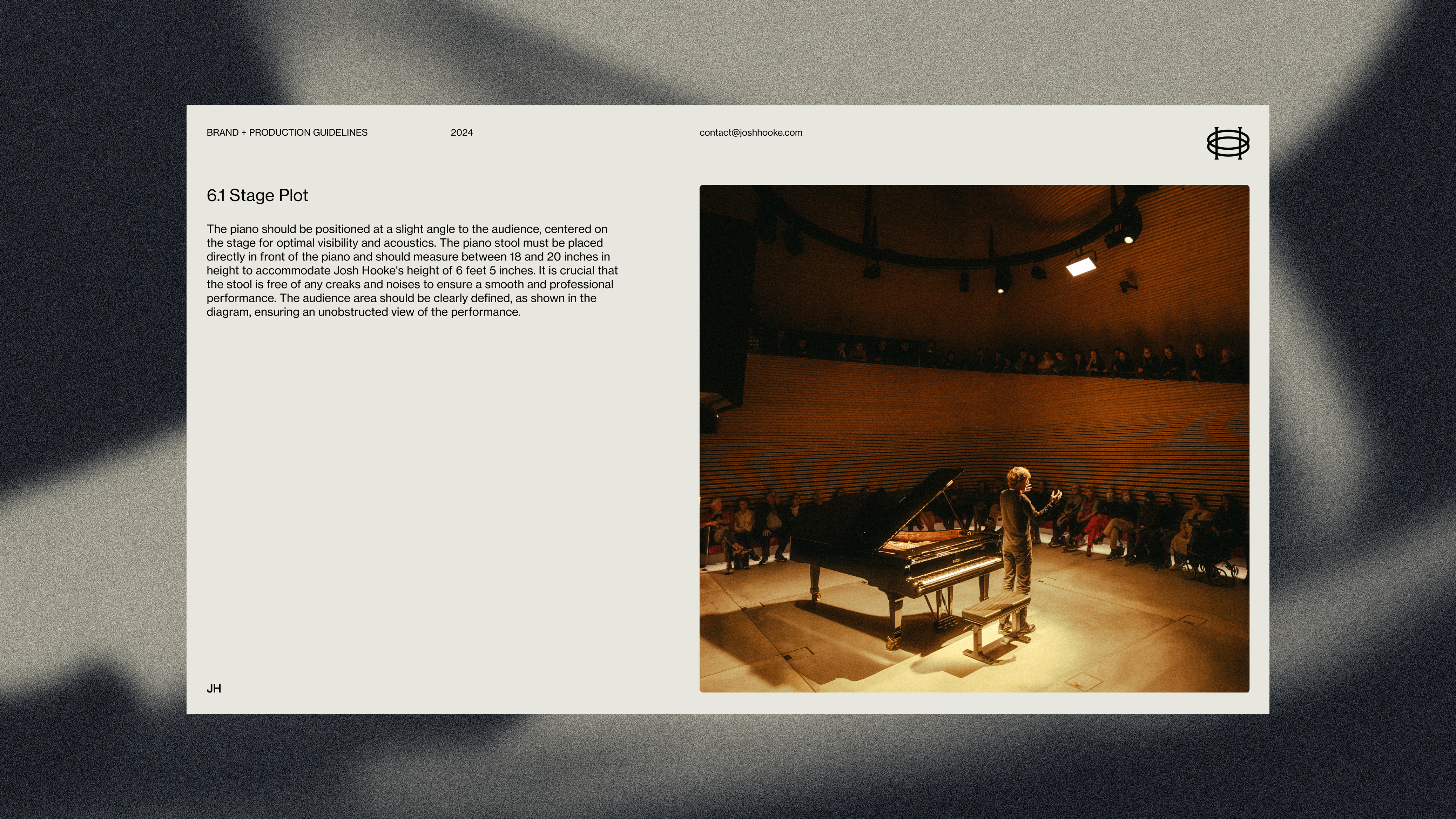
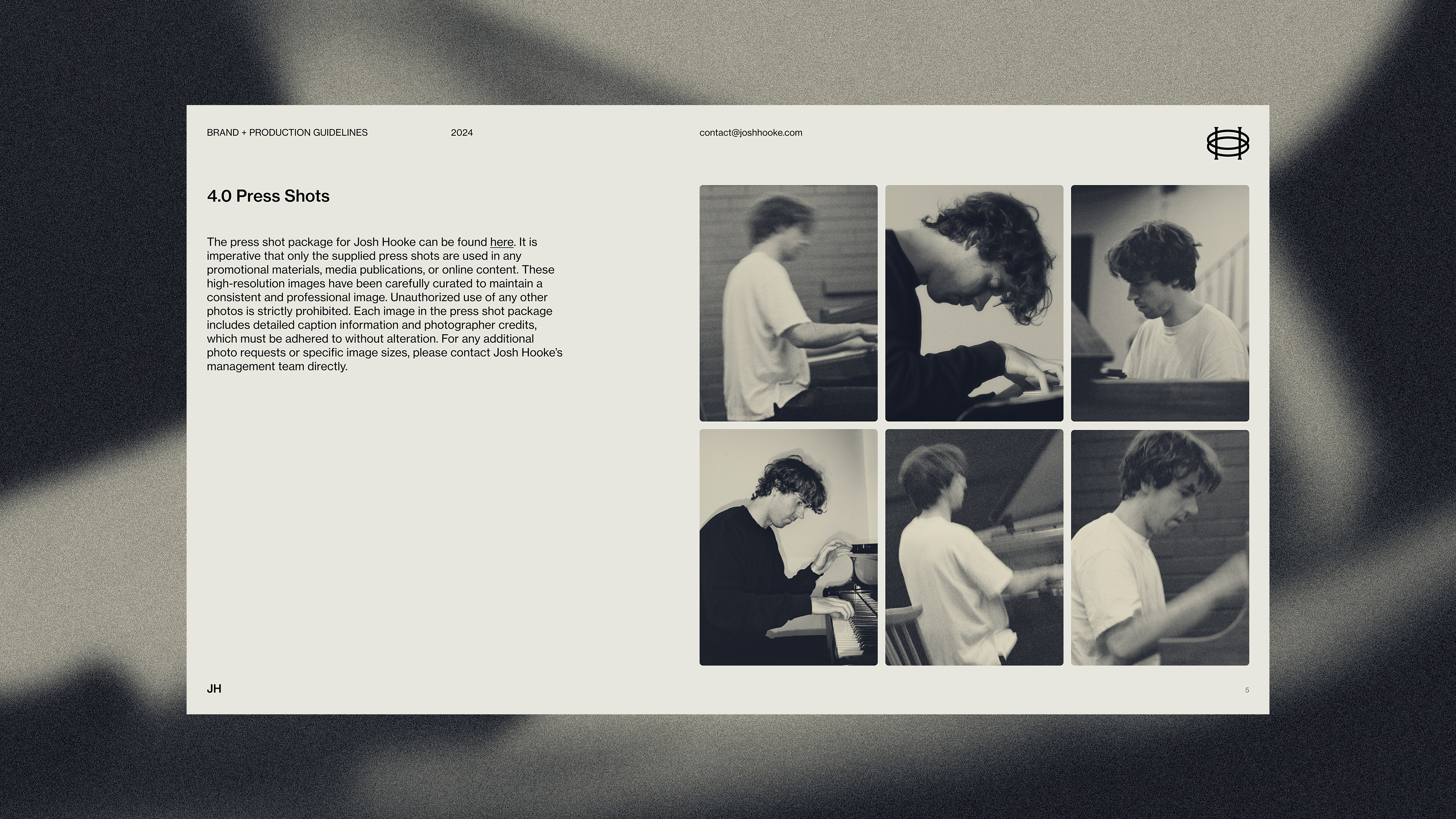
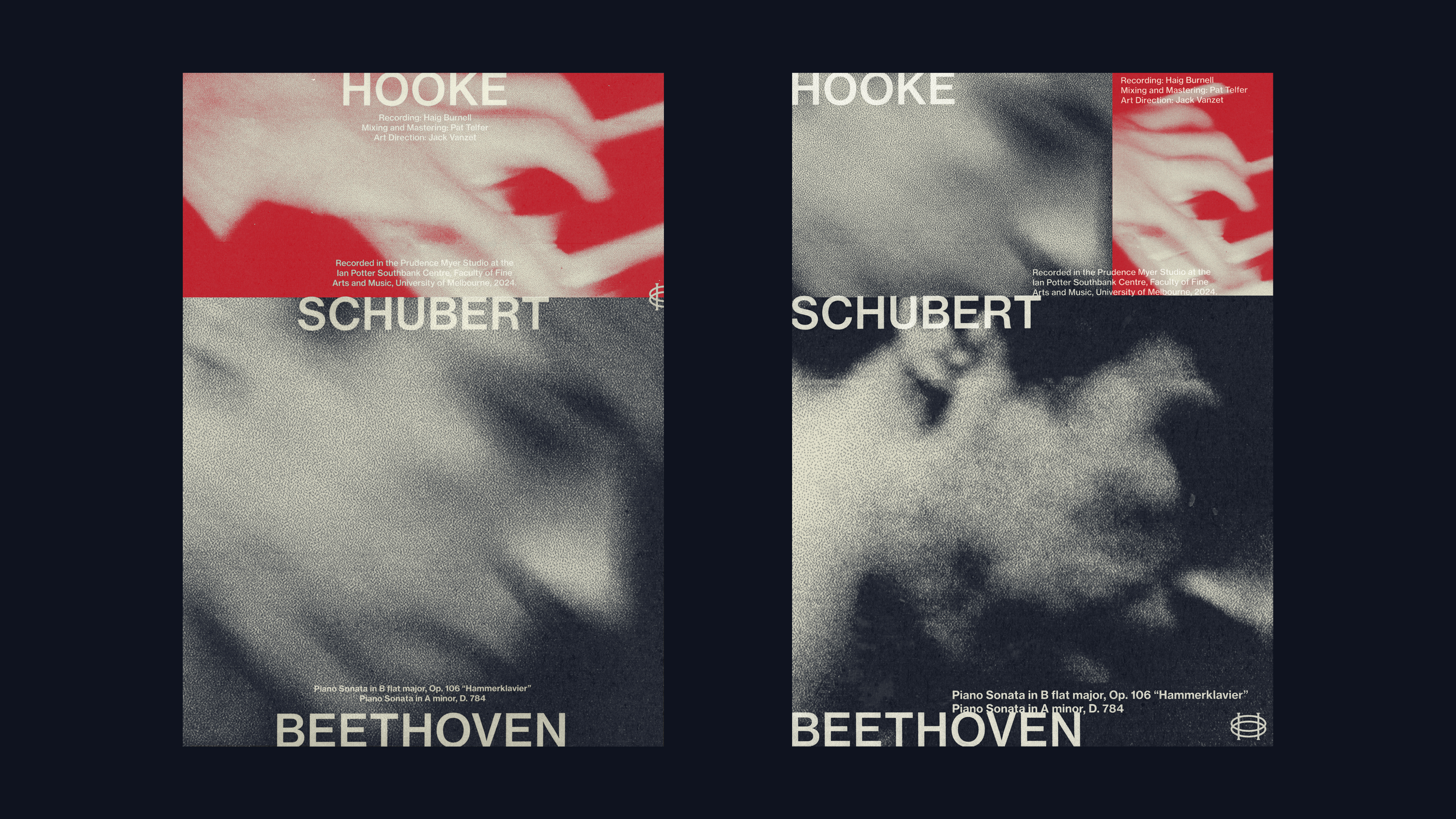
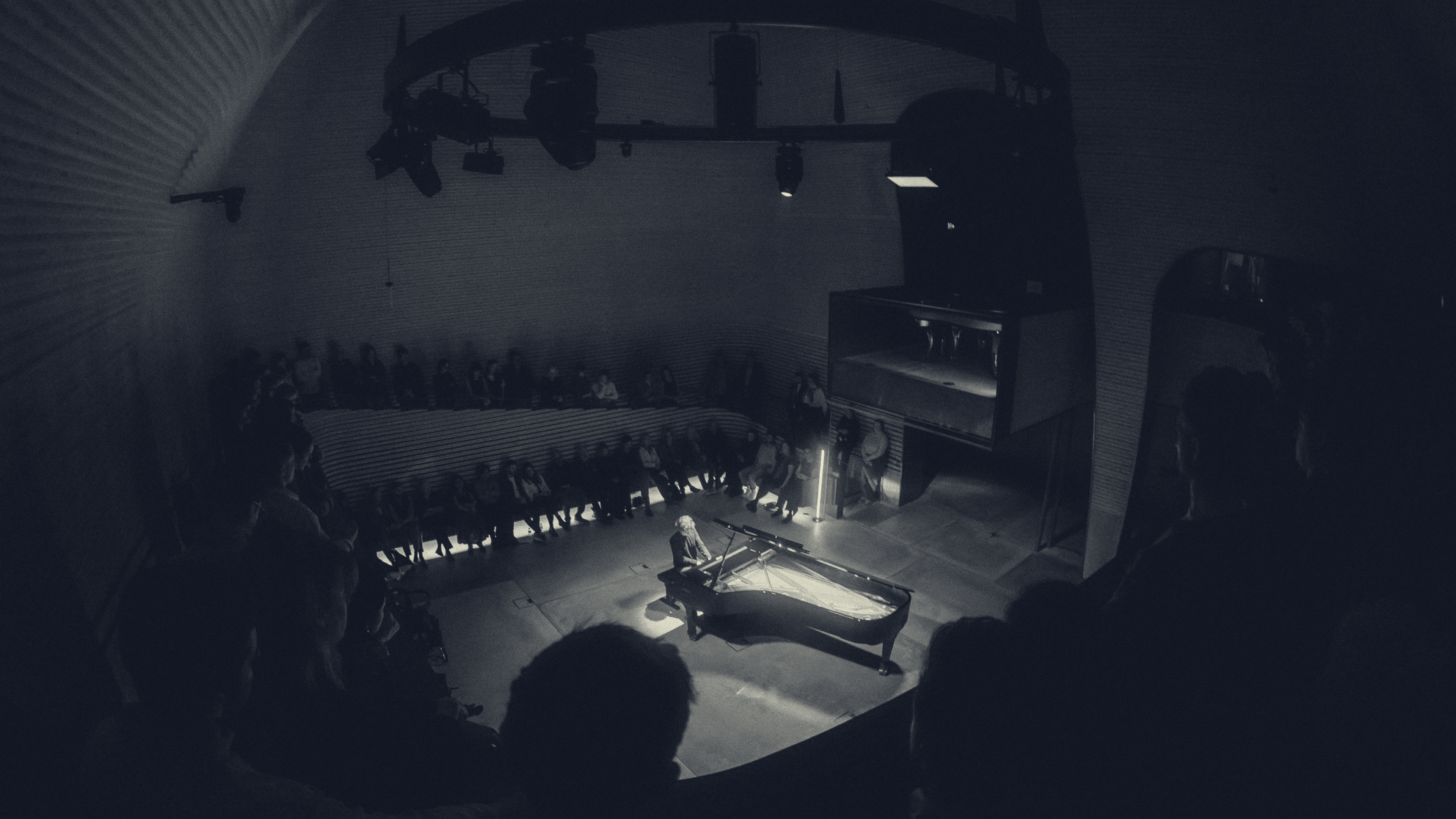
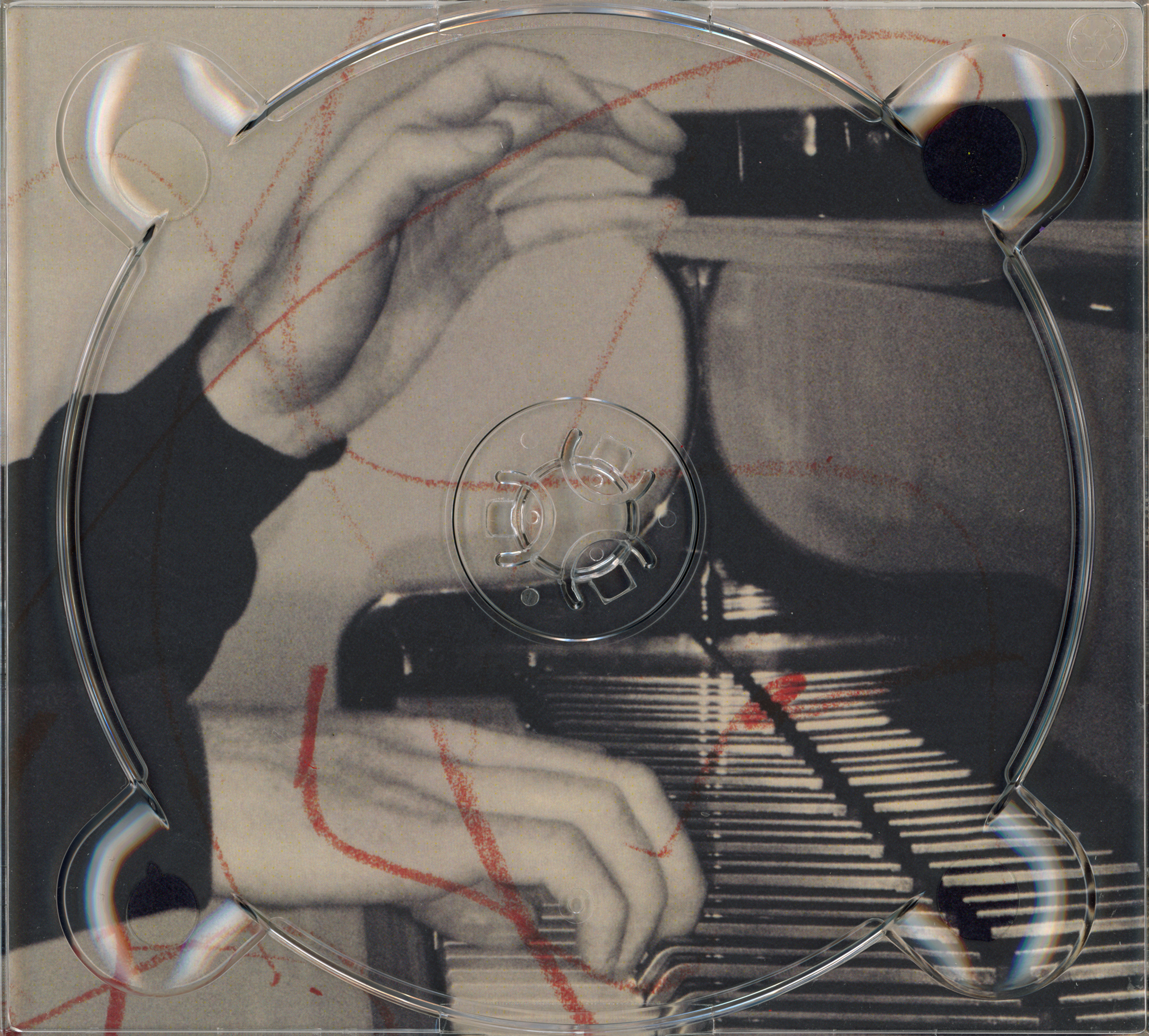
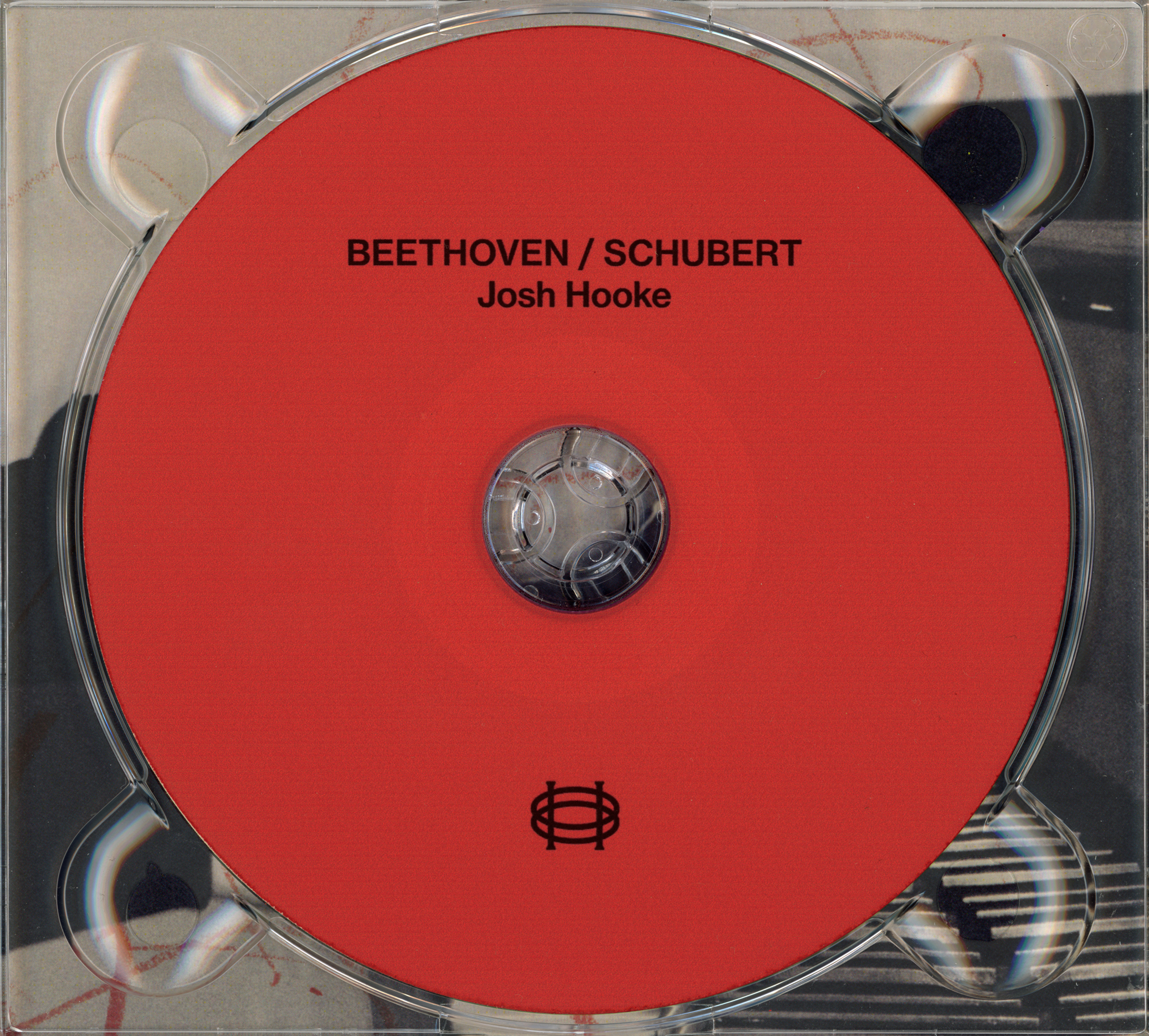
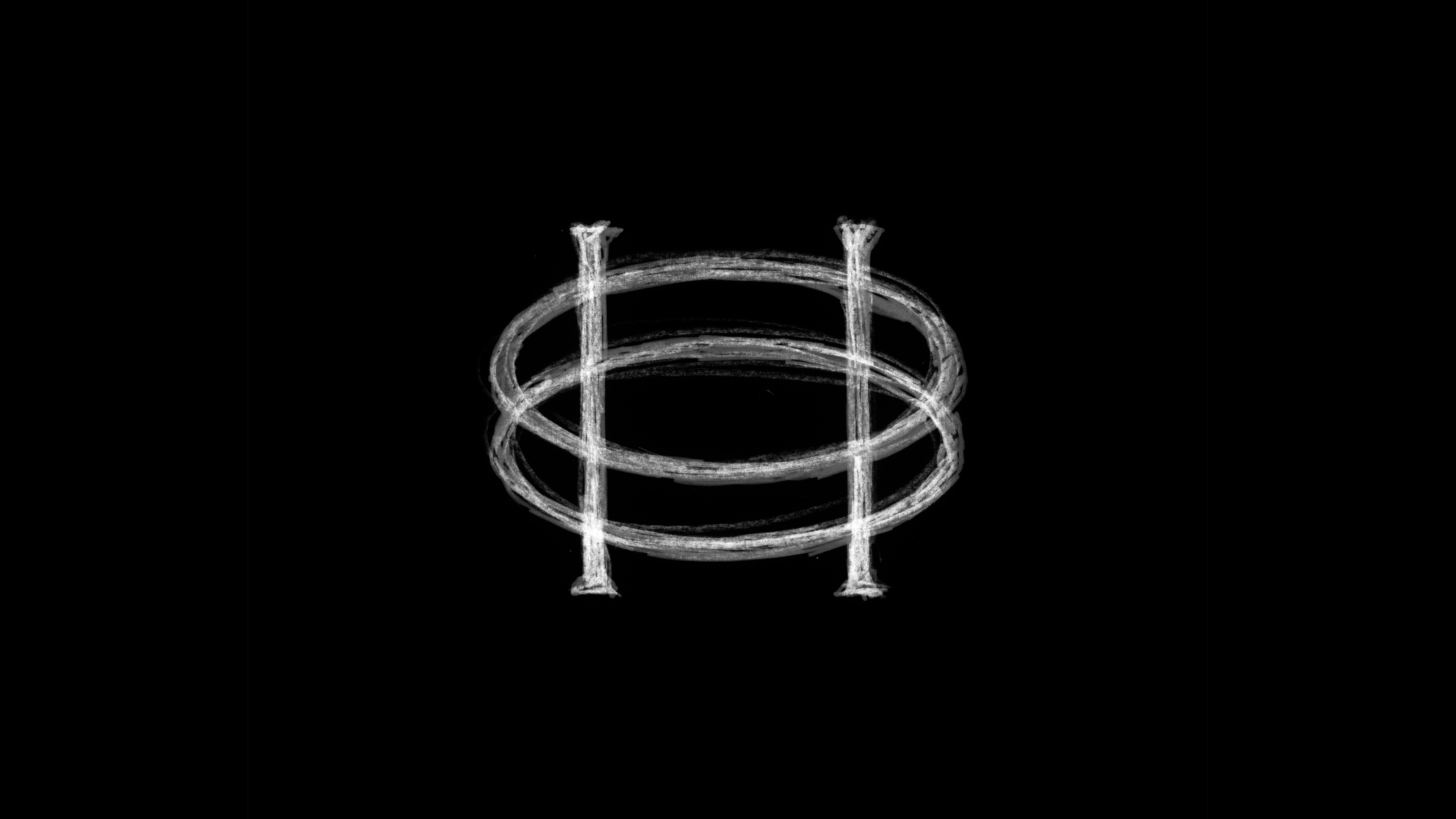
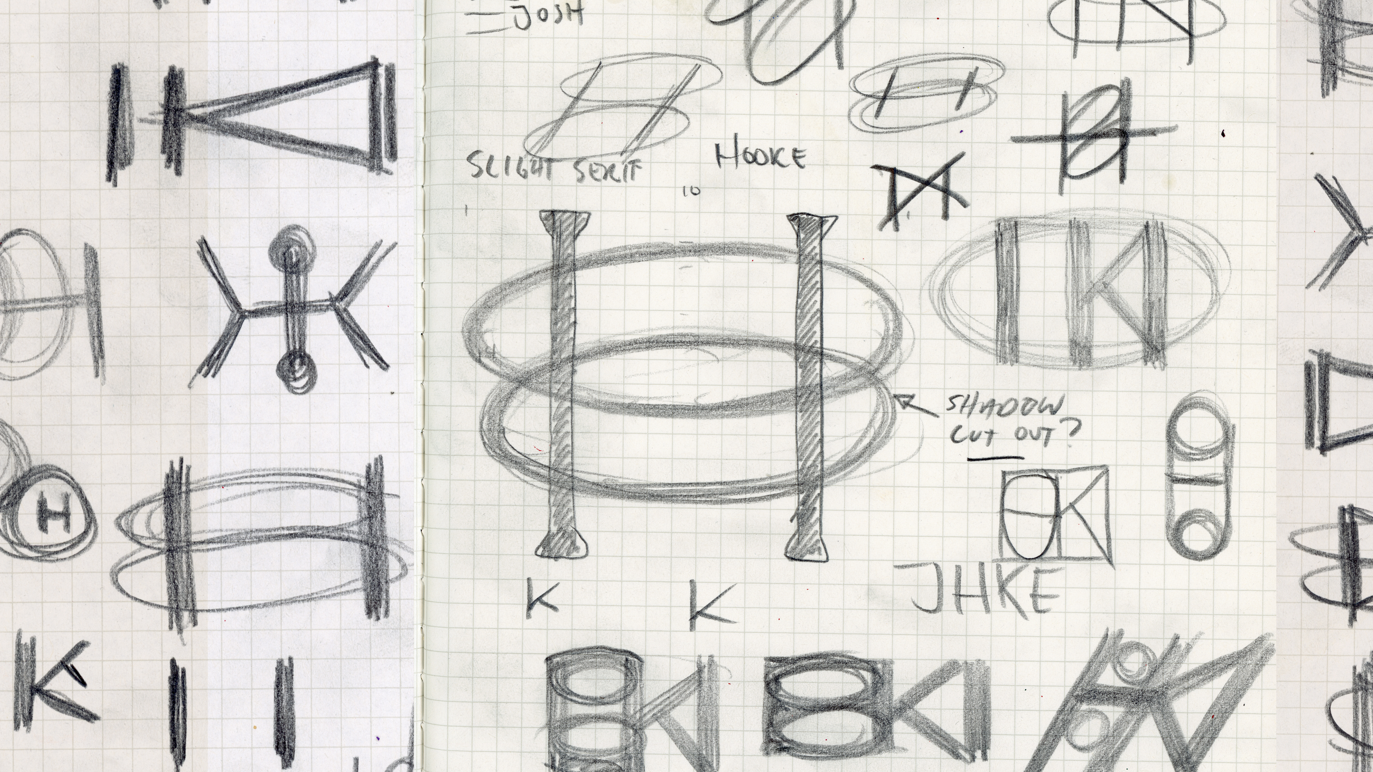
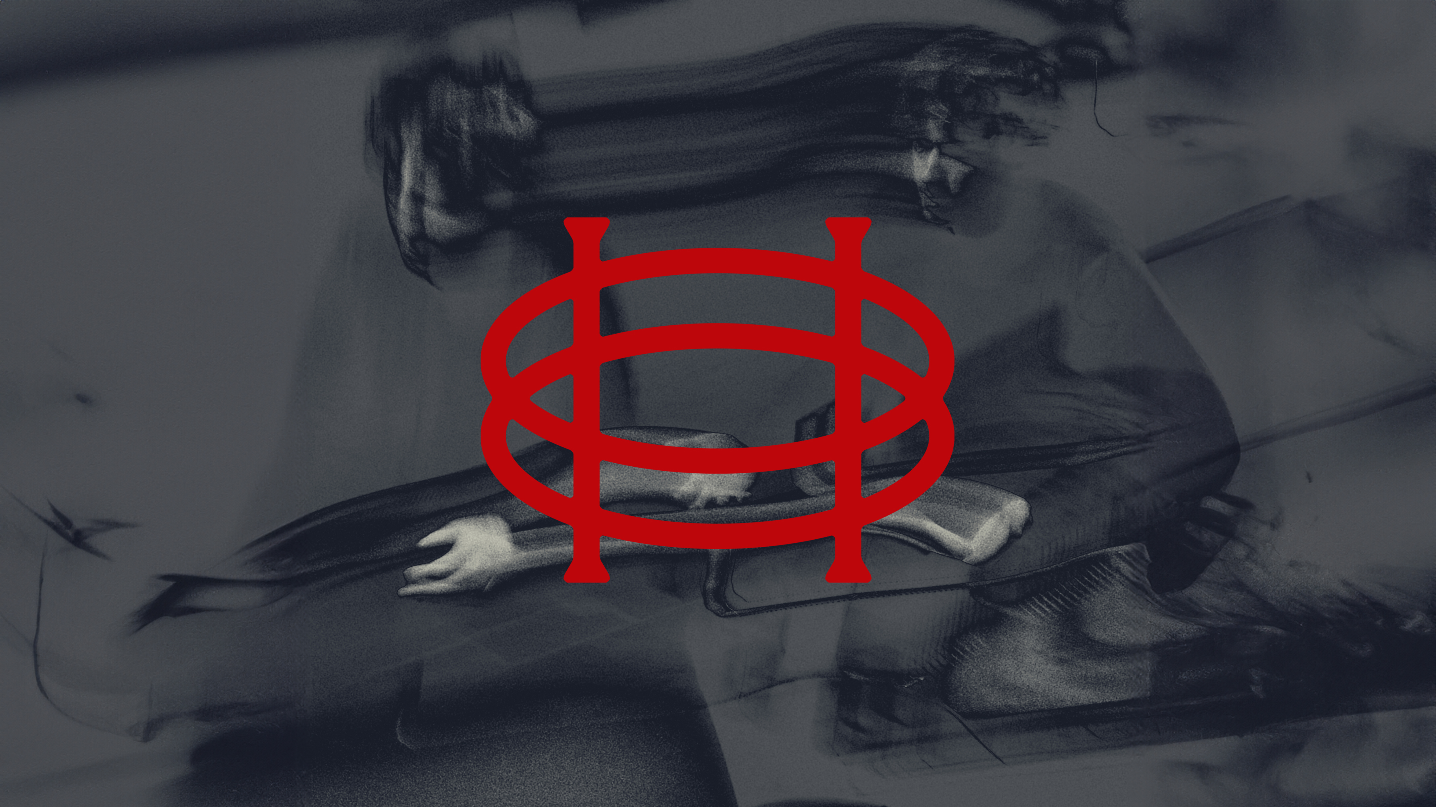
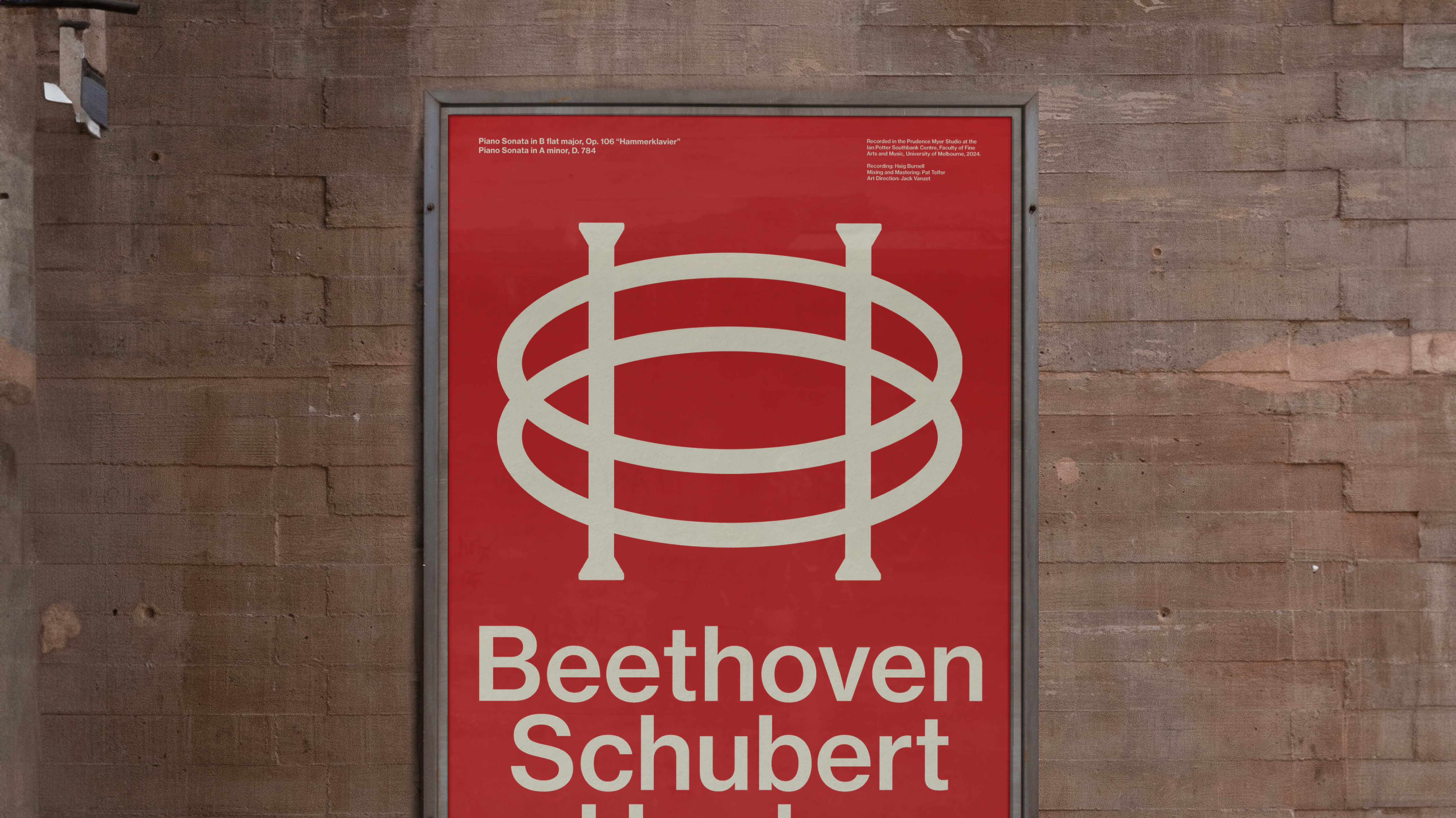
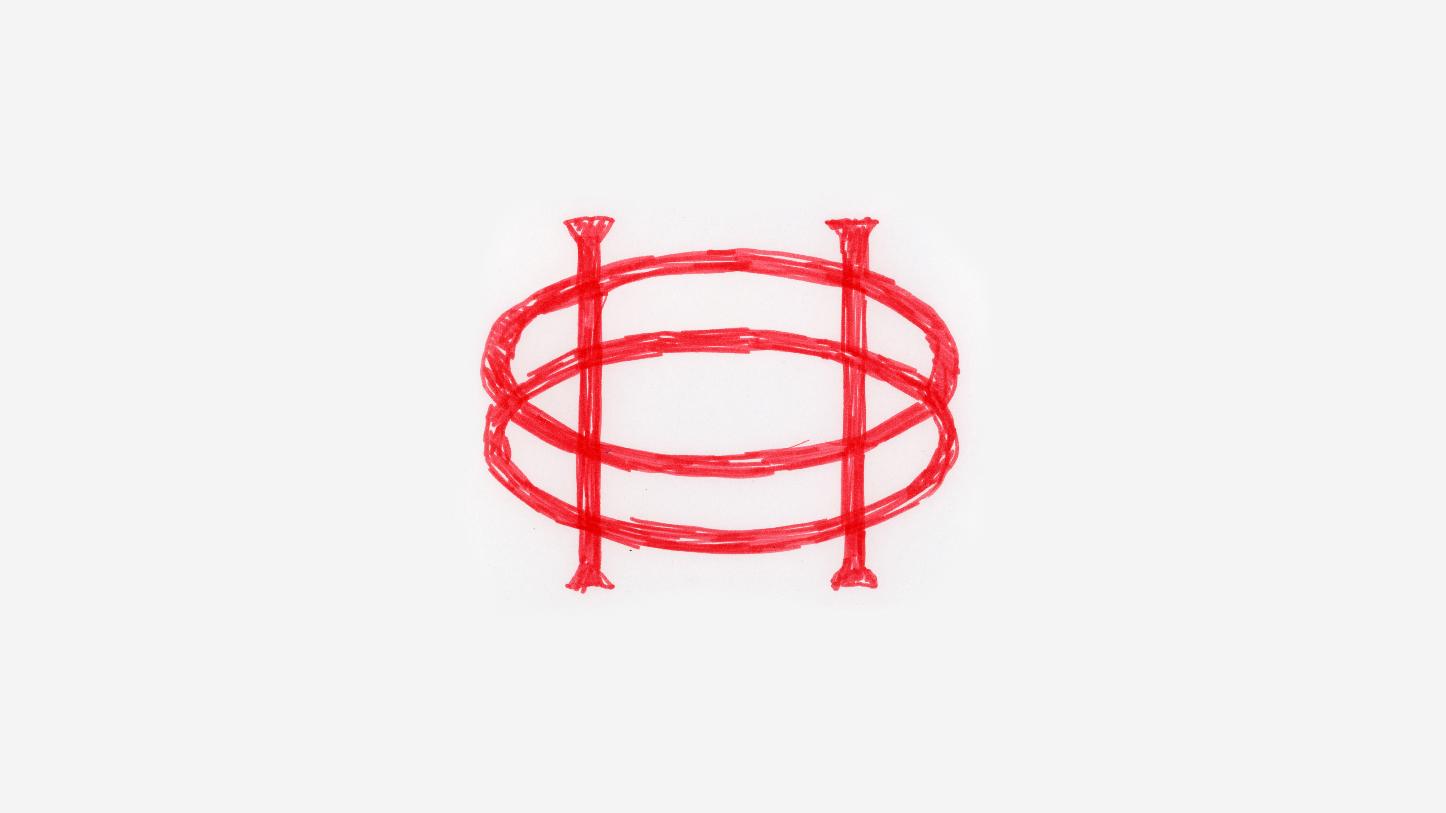
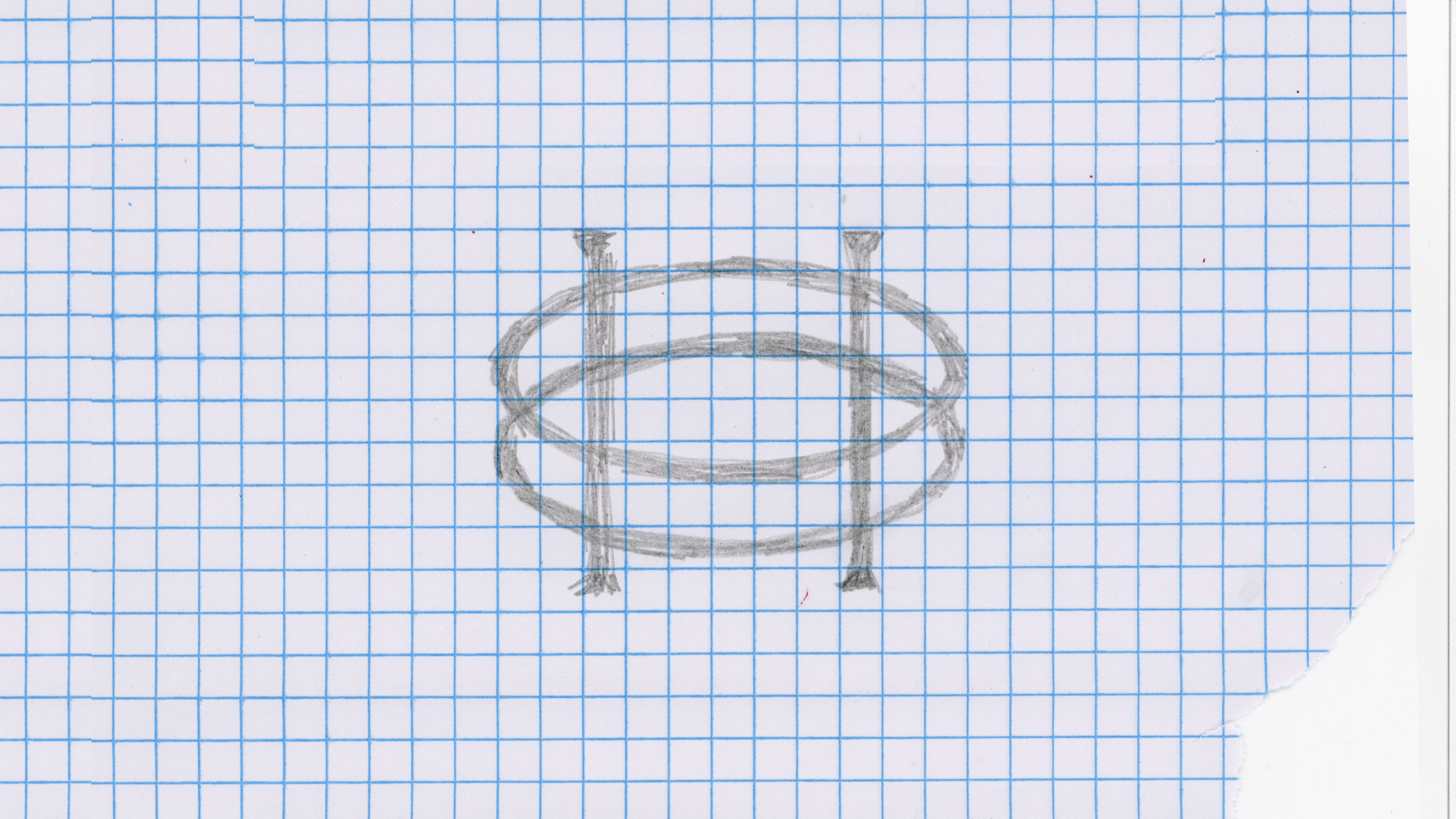
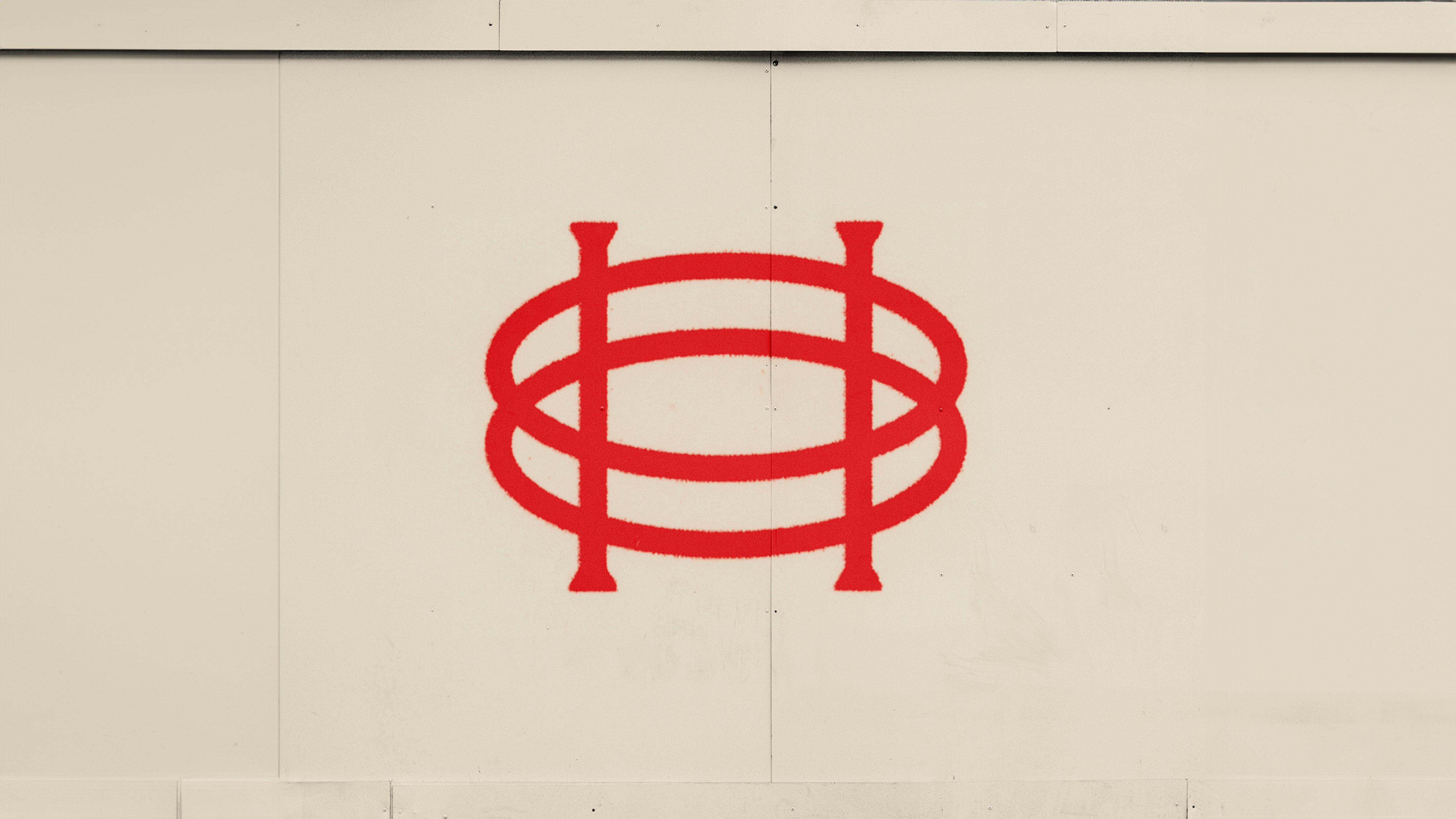
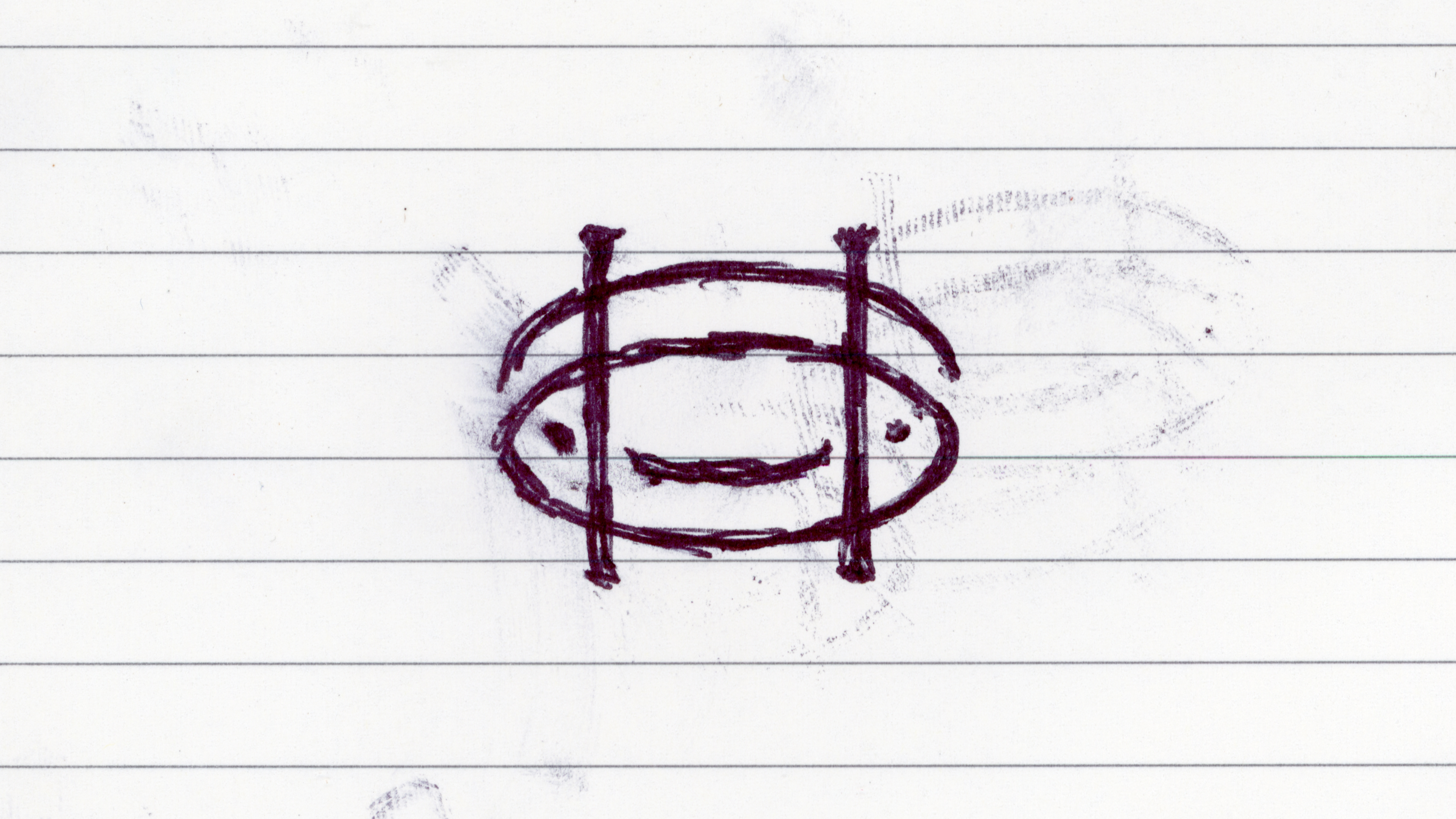
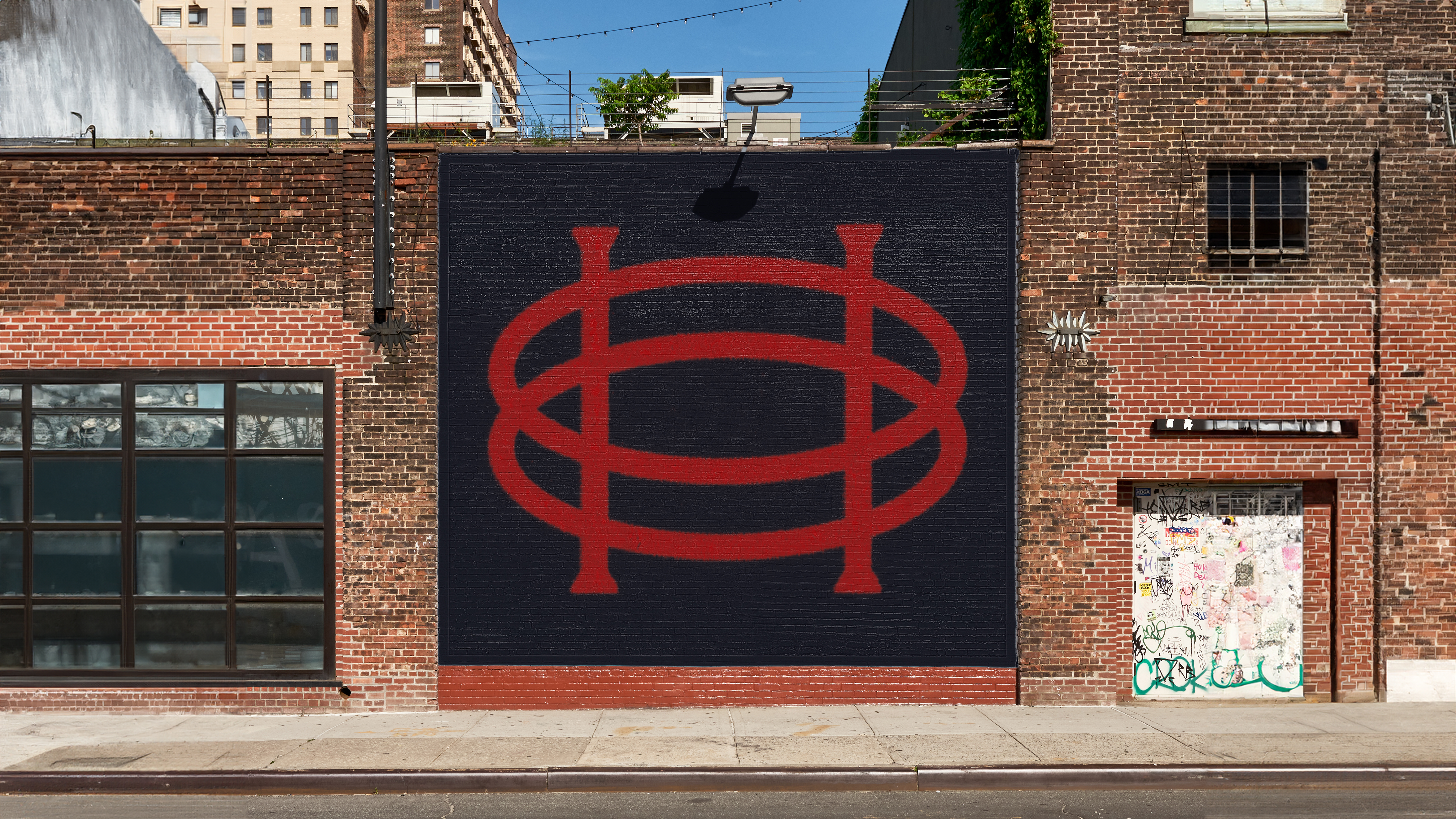
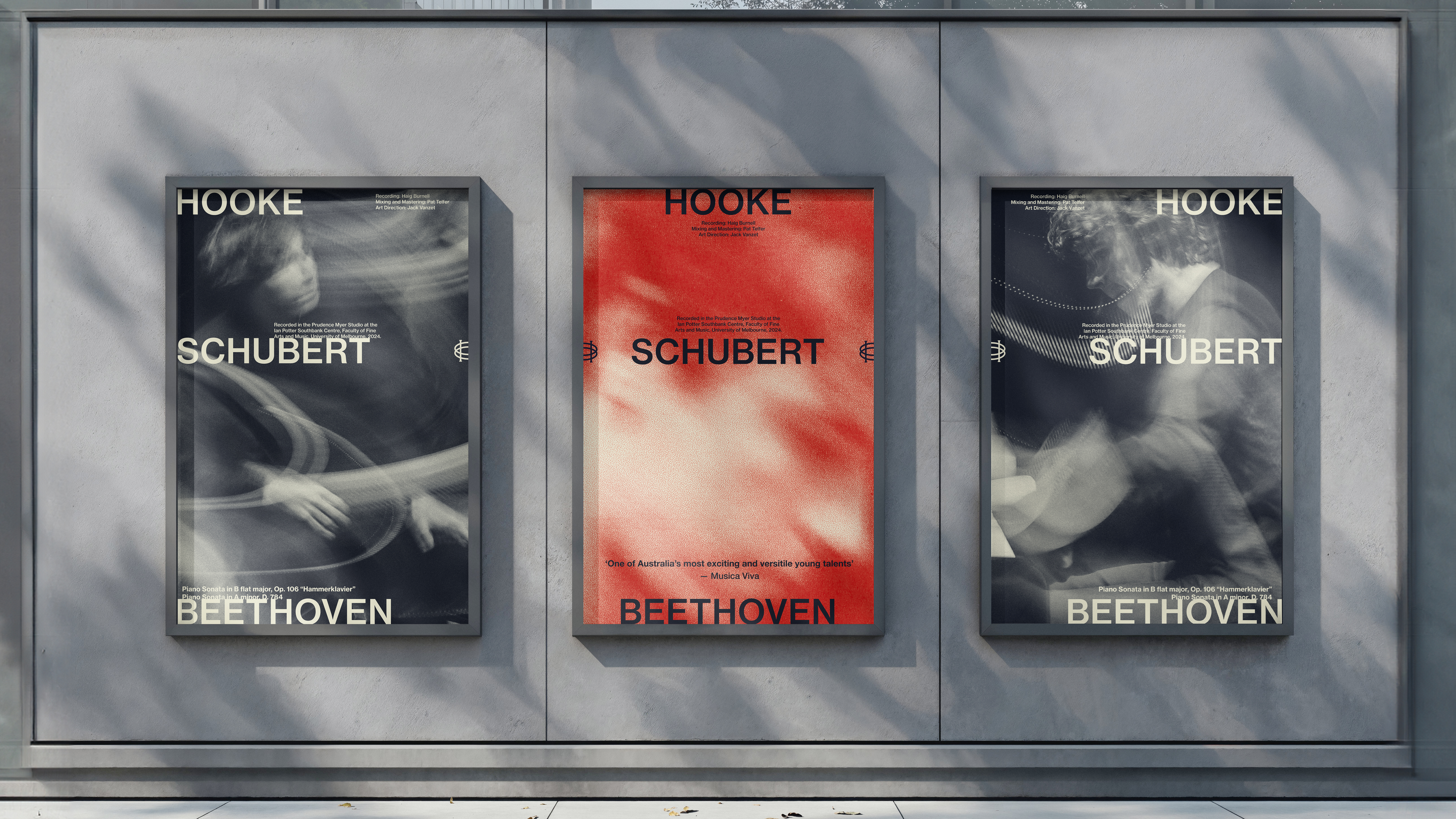
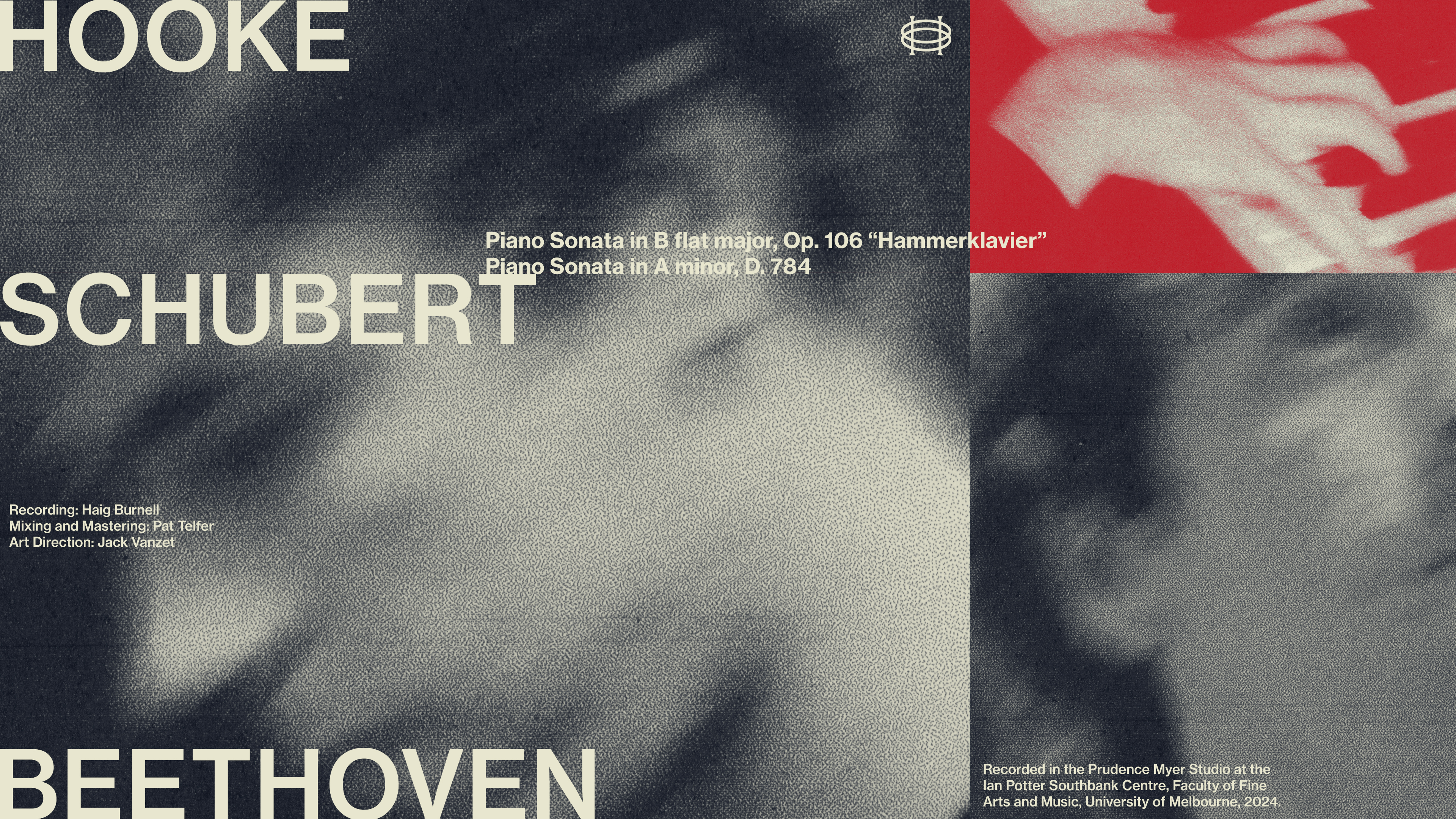
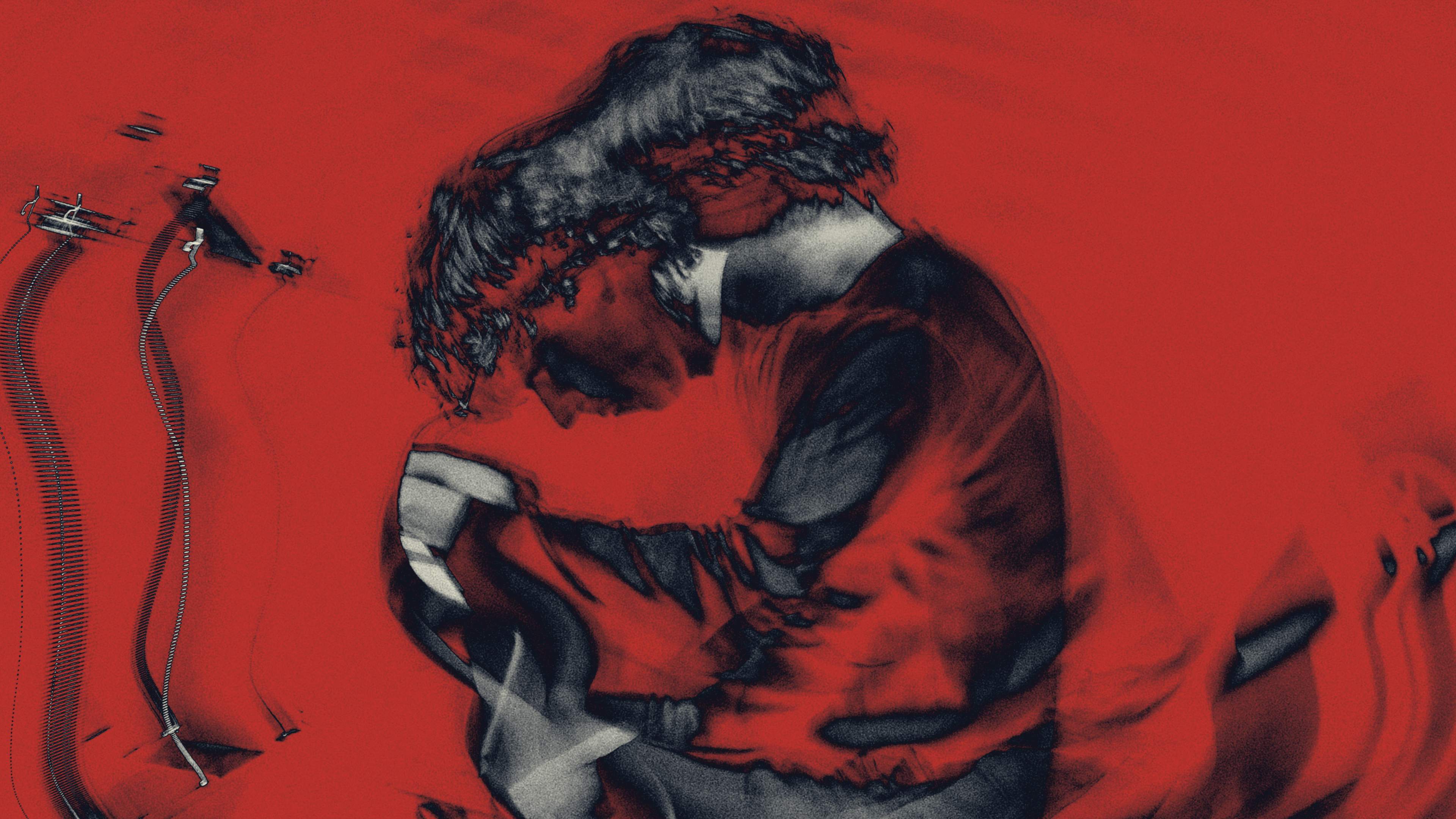
For the release of Josh Hooke's latest album, a new visual identity was developed to capture the intensity and energy of his performances. One of Australia’s most acclaimed concert pianists, Josh is an award-winning performer praised for his virtuosity. The goal was to create a brand that felt accessible, bold and understated, reflecting the contrast between his calm demeanour off stage and the emotional intensity, flamboyance and passion of his performances.
Reflecting the three artists, the rule of thirds served as a guiding principle for design choices throughout the campaign.
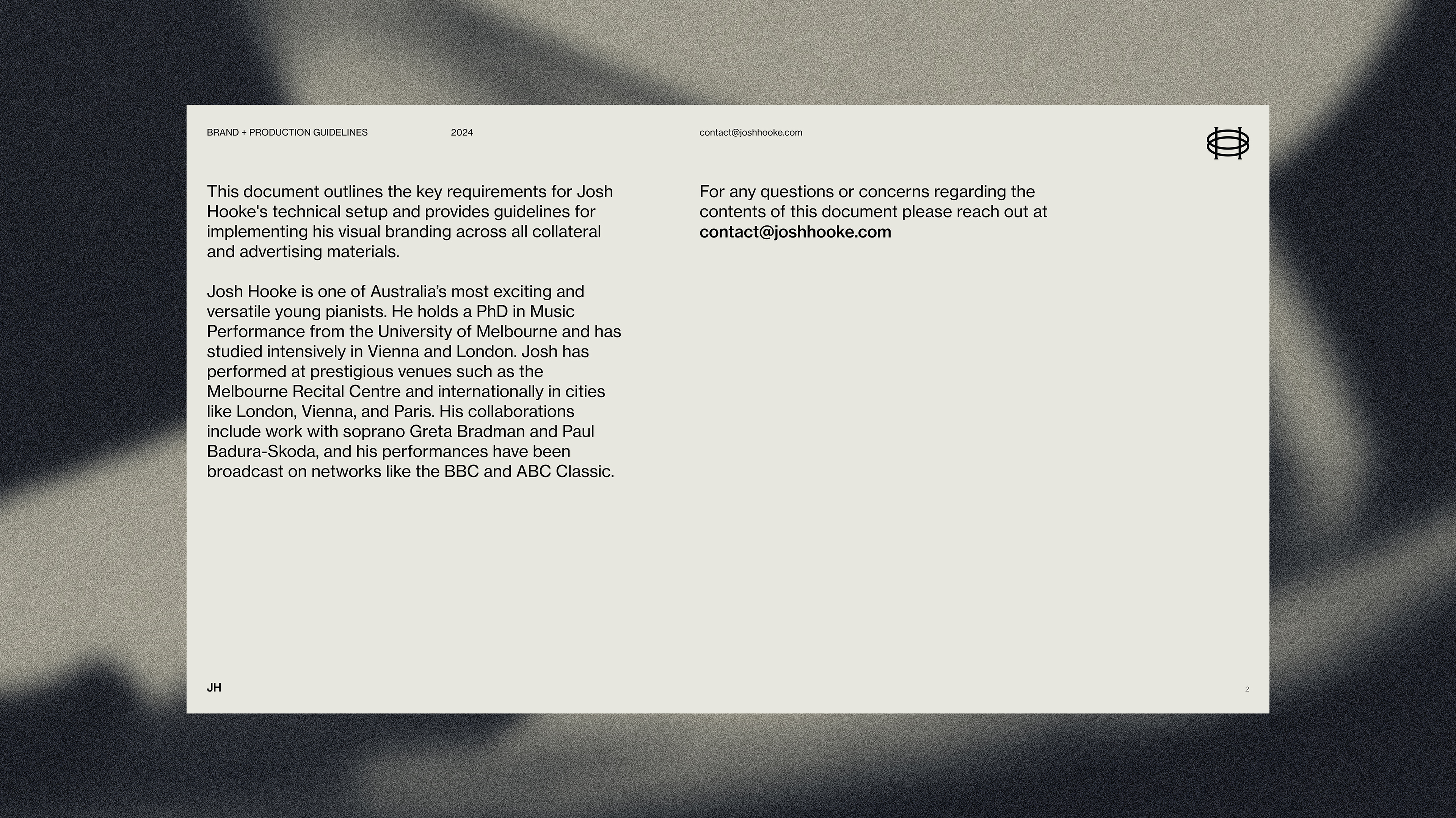
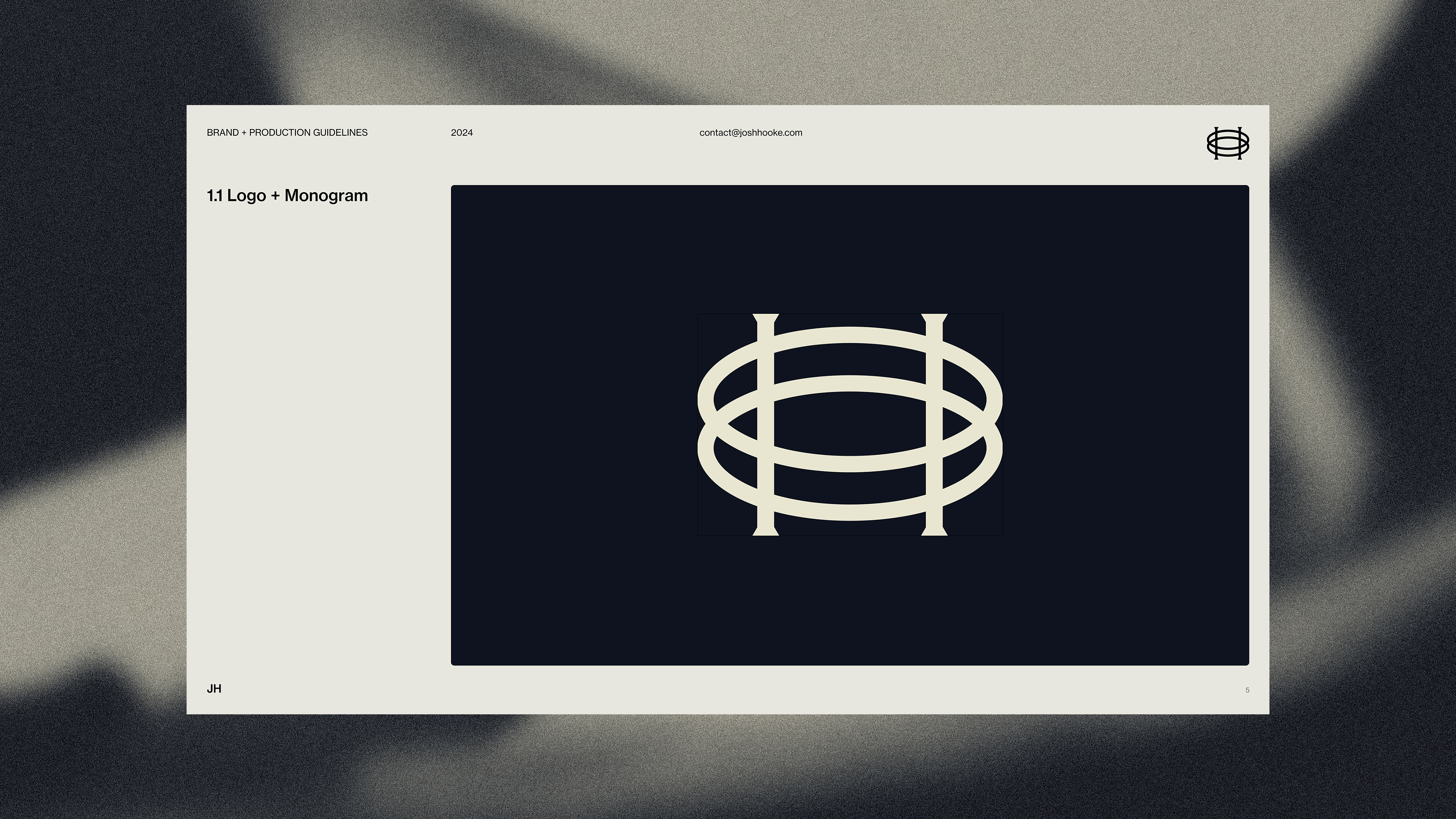
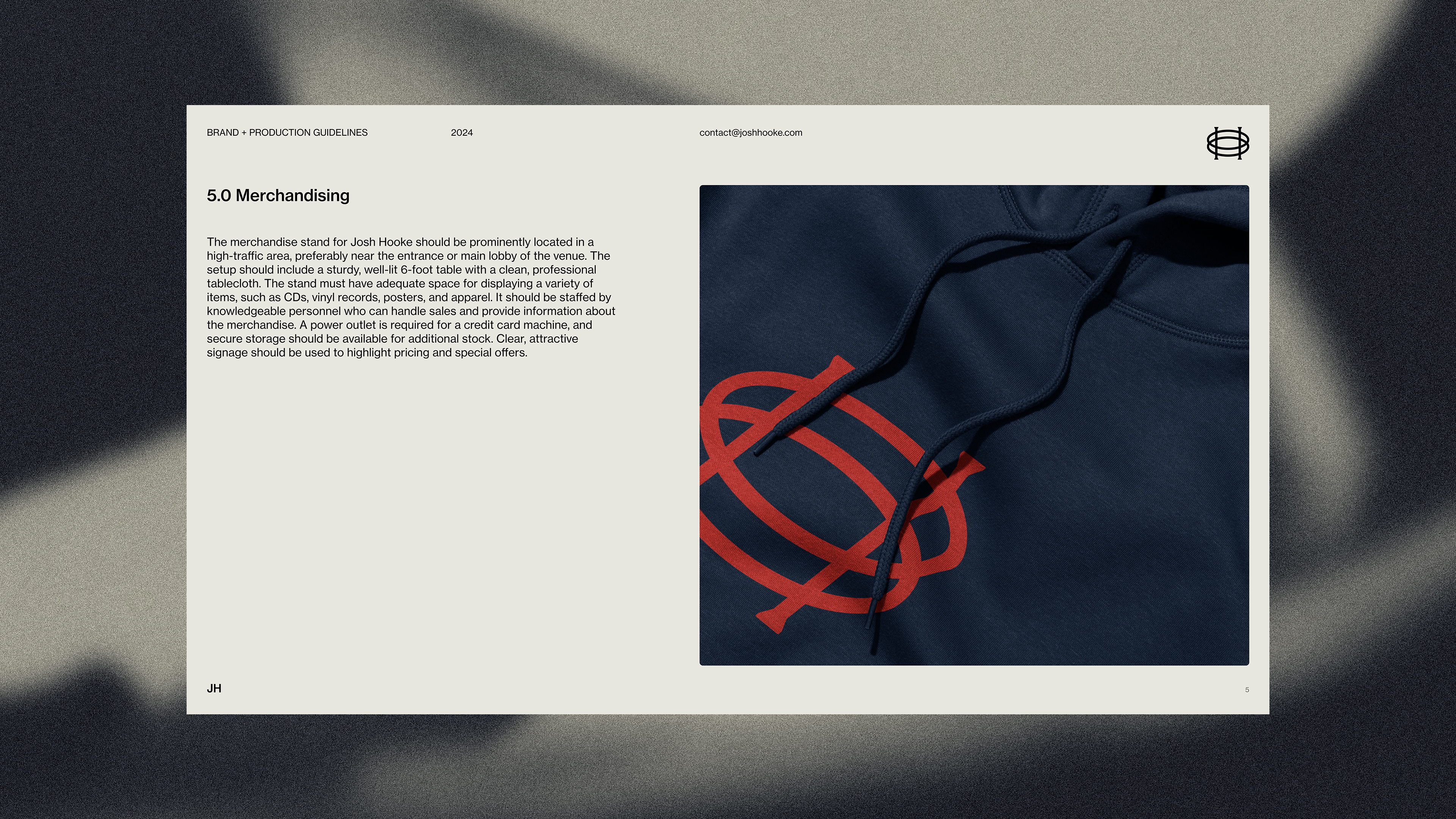
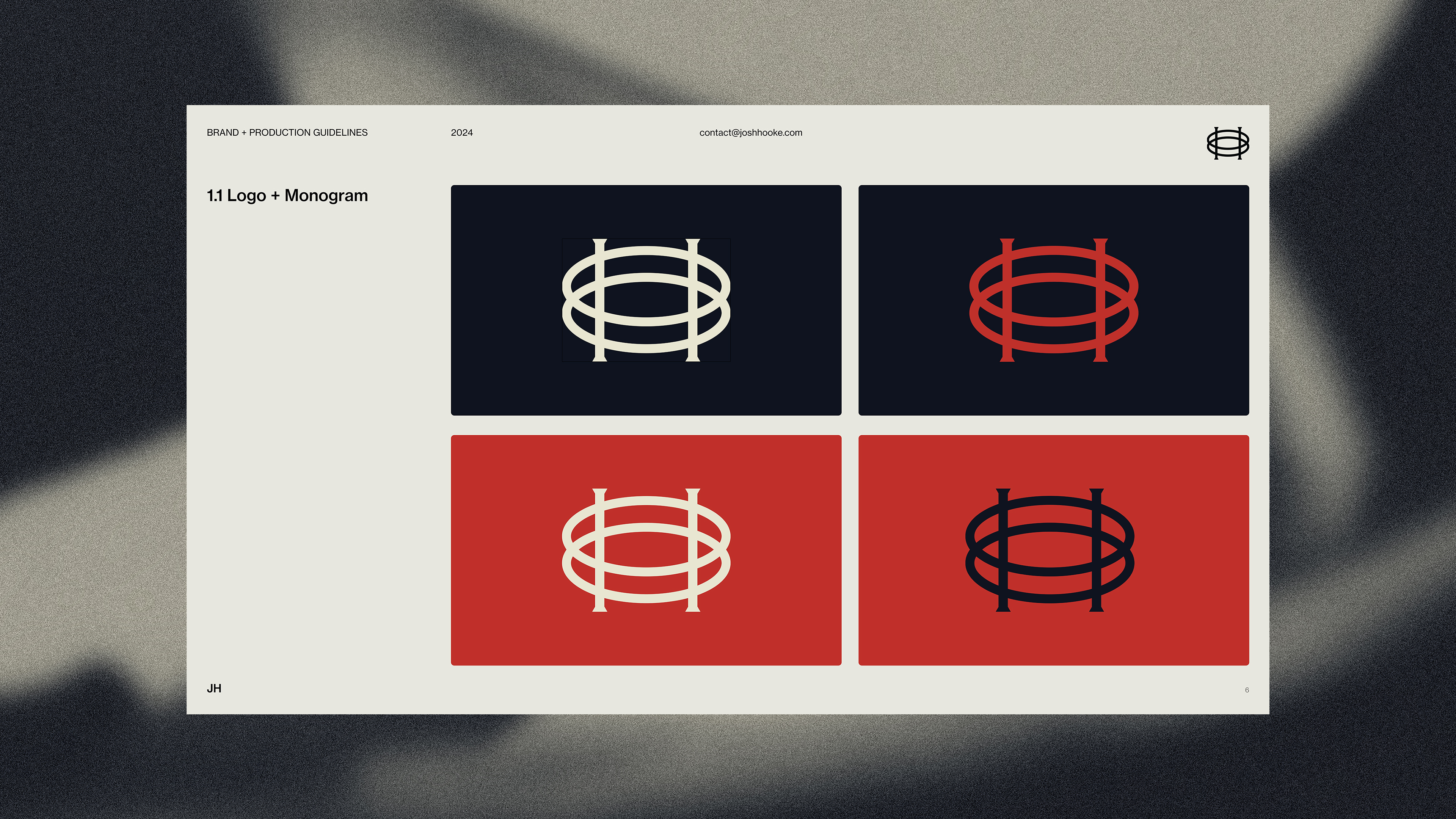
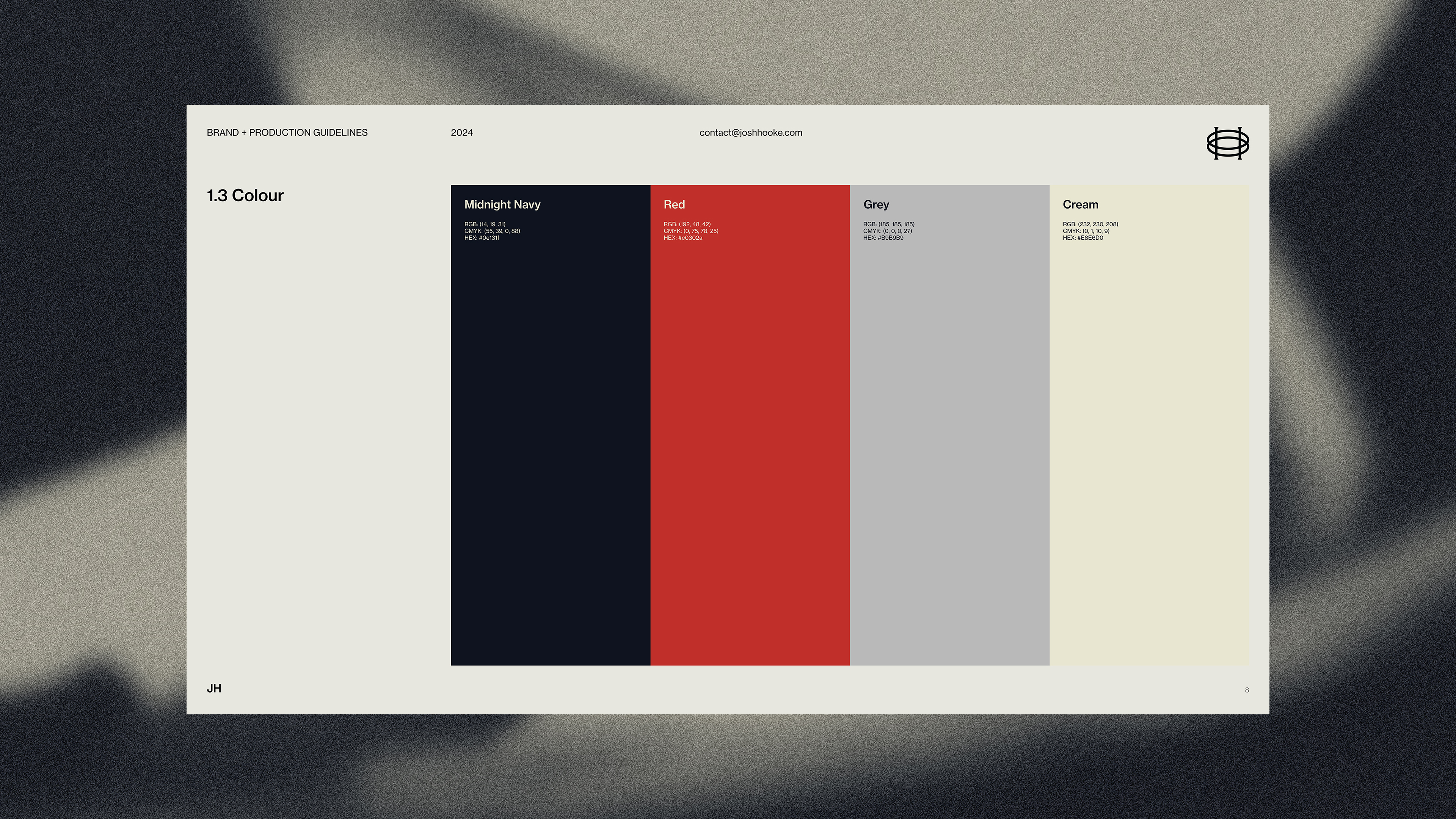
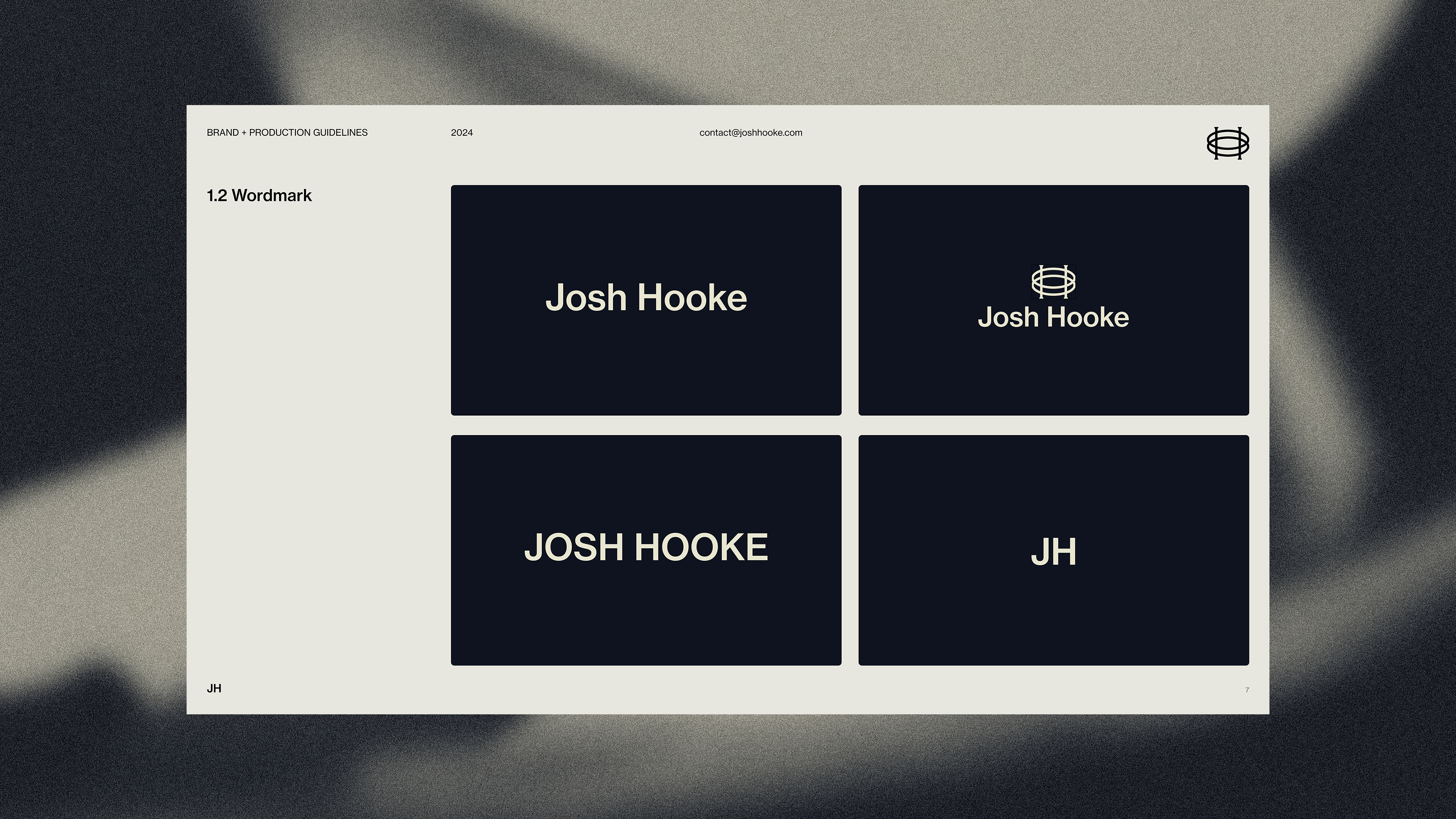
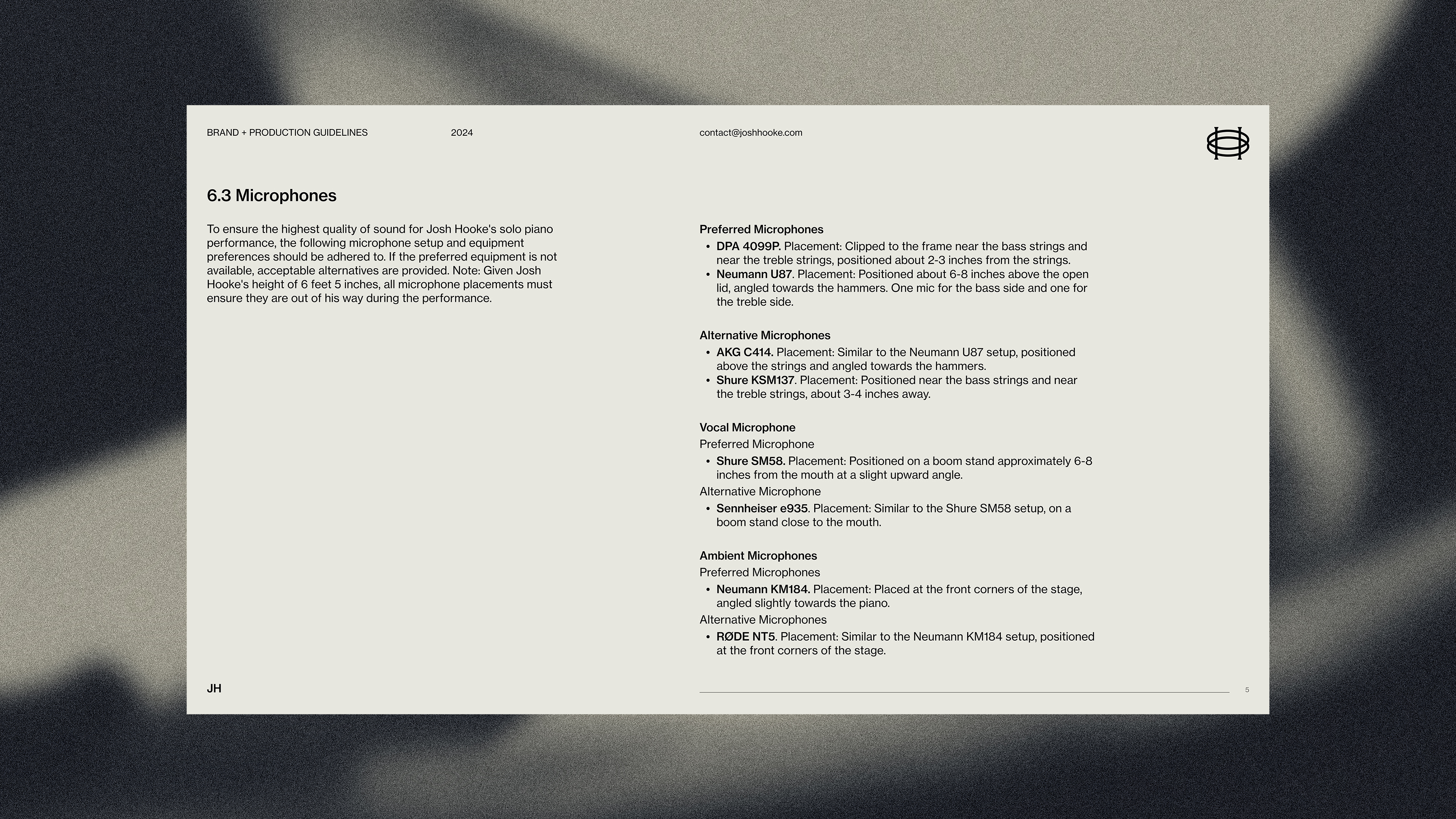
A comprehensive set of brand guidelines was also developed for venues and media, ensuring consistent and effective representation across all platforms.
Reflecting the three artists, the rule of thirds served as a guiding principle for design choices throughout the campaign.
A comprehensive set of brand guidelines was also developed for venues and media, ensuring consistent and effective representation across all platforms.
Key deliverables
Creative direction
Identity design
Social campaign
Merchandise
Motion design
Brand guidelines
Digital
OOH
Additional photography from Jordan Munns and Sonny Witton
Creative direction
Identity design
Social campaign
Merchandise
Motion design
Brand guidelines
Digital
OOH
Additional photography from Jordan Munns and Sonny Witton














YouTube
This case study documents audio work developed with YouTube Creative Studio as part of YouTube’s recent rebrand. Across two engagements, I worked on the sonic layer surrounding the rebrand, spanning early system exploration and final delivery. This included exploring how a unified audio approach could extend across different parts of the YouTube ecosystem, alongside leading the complete audio production for the official rebrand case study film.
A key focus was developing and testing how a flexible, scalable sonic framework could support a global product ecosystem, balancing consistency with the ability to adapt across different contexts, formats, and expressions.
The work brought together composition, sound design, and voice direction, delivered end to end in collaboration with YouTube’s brand, motion, and production teams. The aim was a cohesive, emotionally legible audio world that feels alive and dynamic, shaped by YouTube’s layered content culture.
A key focus was developing and testing how a flexible, scalable sonic framework could support a global product ecosystem, balancing consistency with the ability to adapt across different contexts, formats, and expressions.
The work brought together composition, sound design, and voice direction, delivered end to end in collaboration with YouTube’s brand, motion, and production teams. The aim was a cohesive, emotionally legible audio world that feels alive and dynamic, shaped by YouTube’s layered content culture.
Role
Audio Lead
Audio Lead
All Things Considered
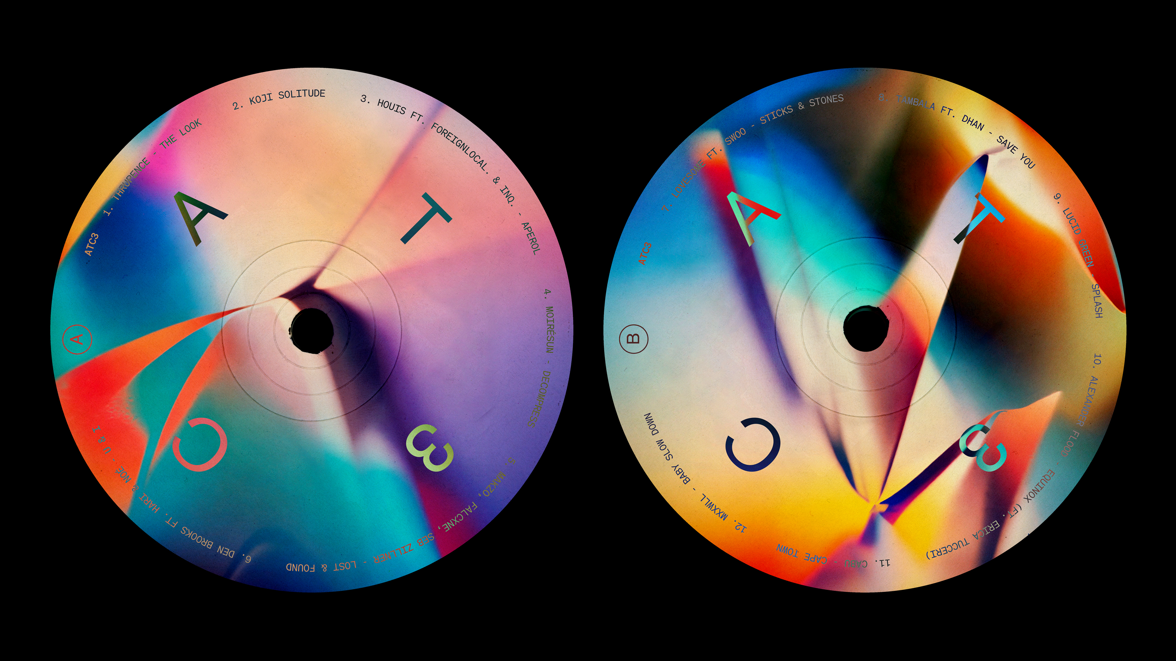
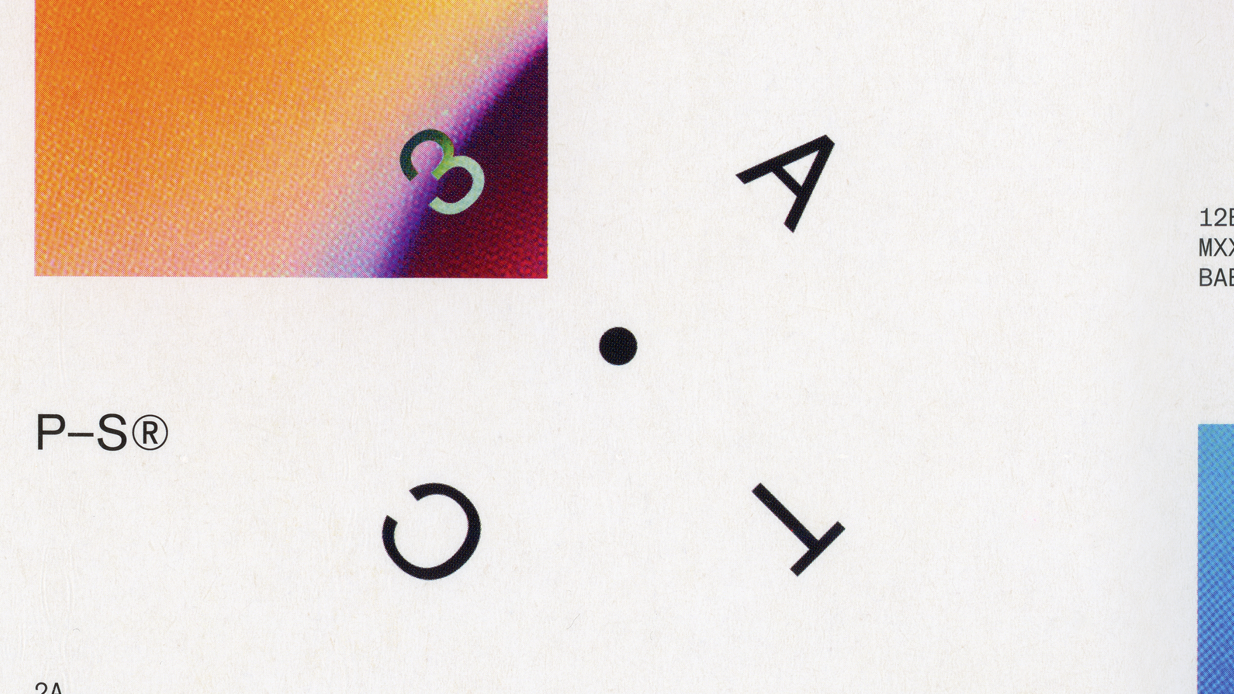
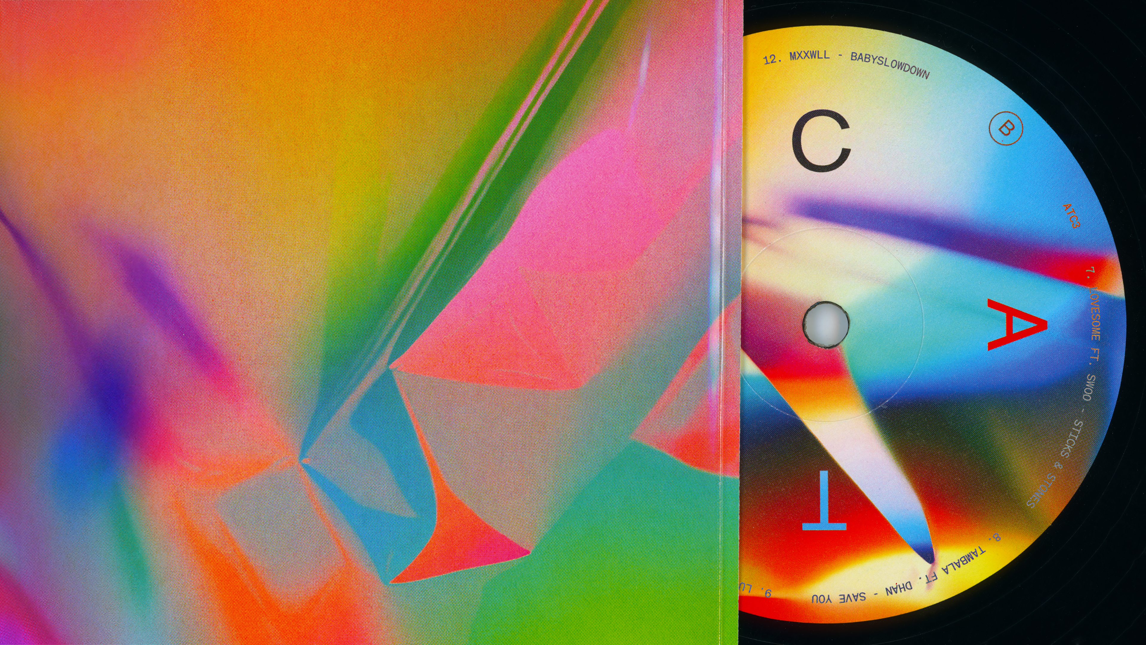
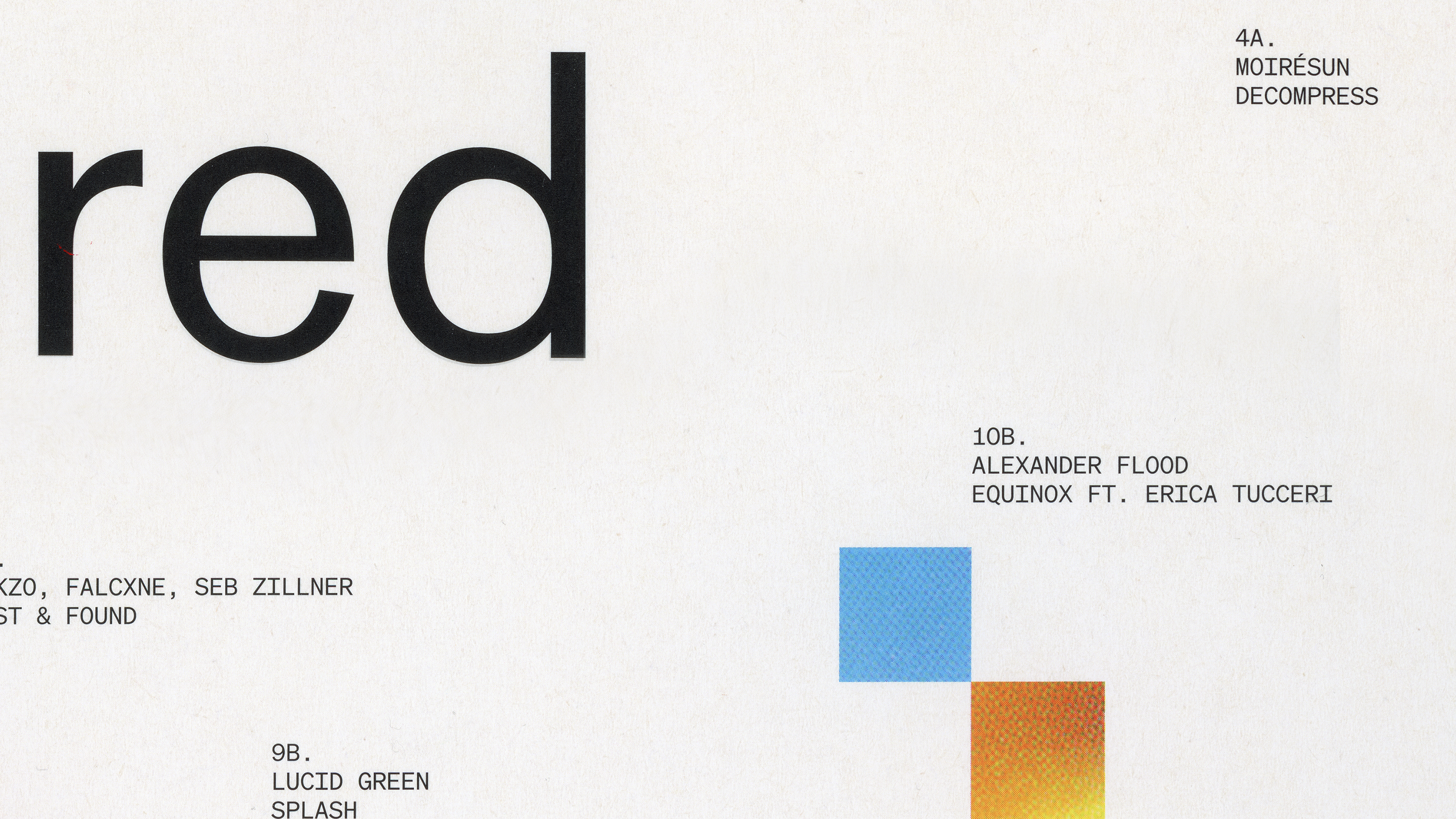
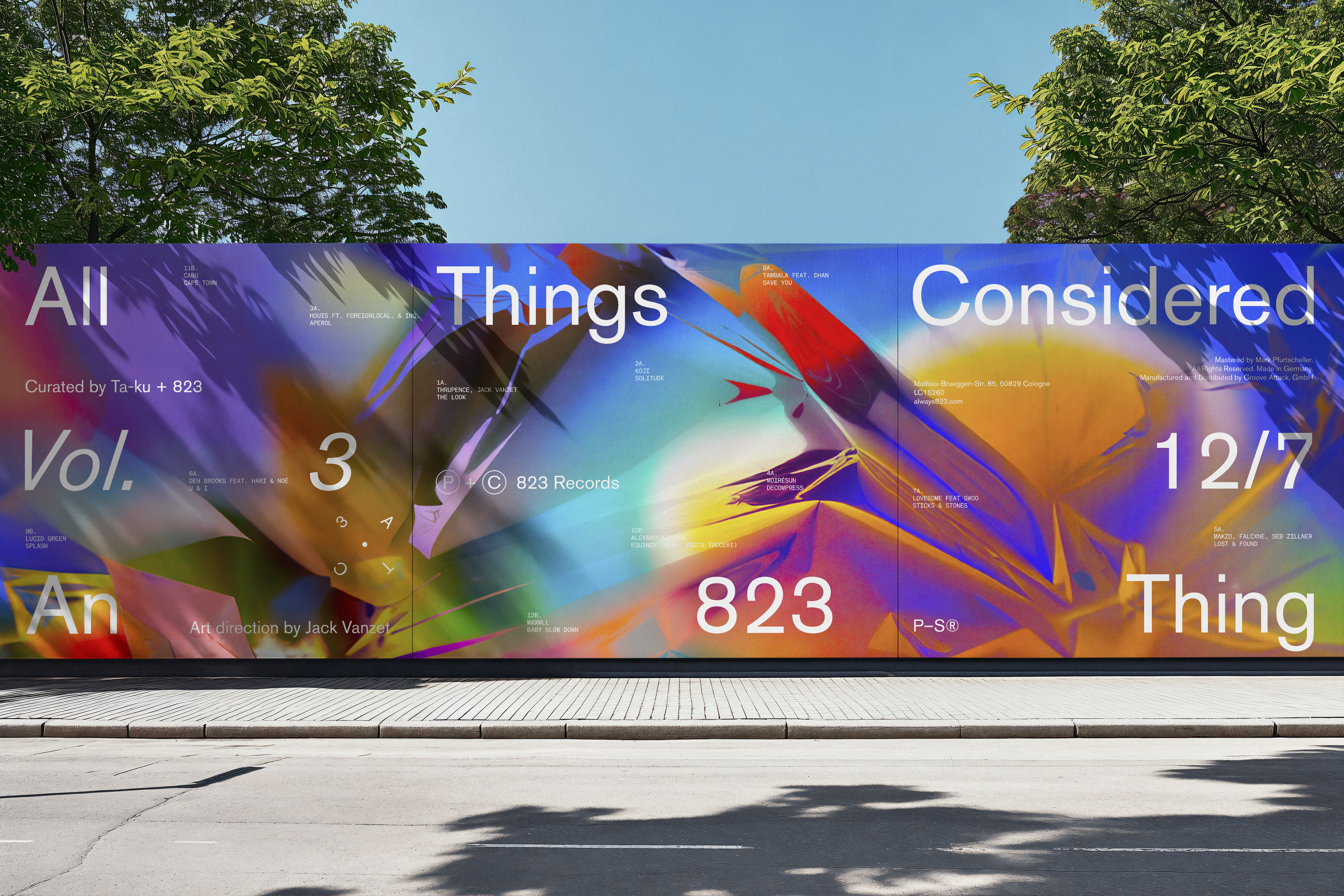
Commissioned by 823 Records and creative agency Pretty–Soon®, the visual identity and campaign for All Things Considered was developed as a vibrant, contemporary system spanning digital, social and physical formats. Built around the collaborative nature of the compilation series, the campaign extended across vinyl, single artworks, visualisers, posters, Spotify Canvases and a broad suite of still and motion content.
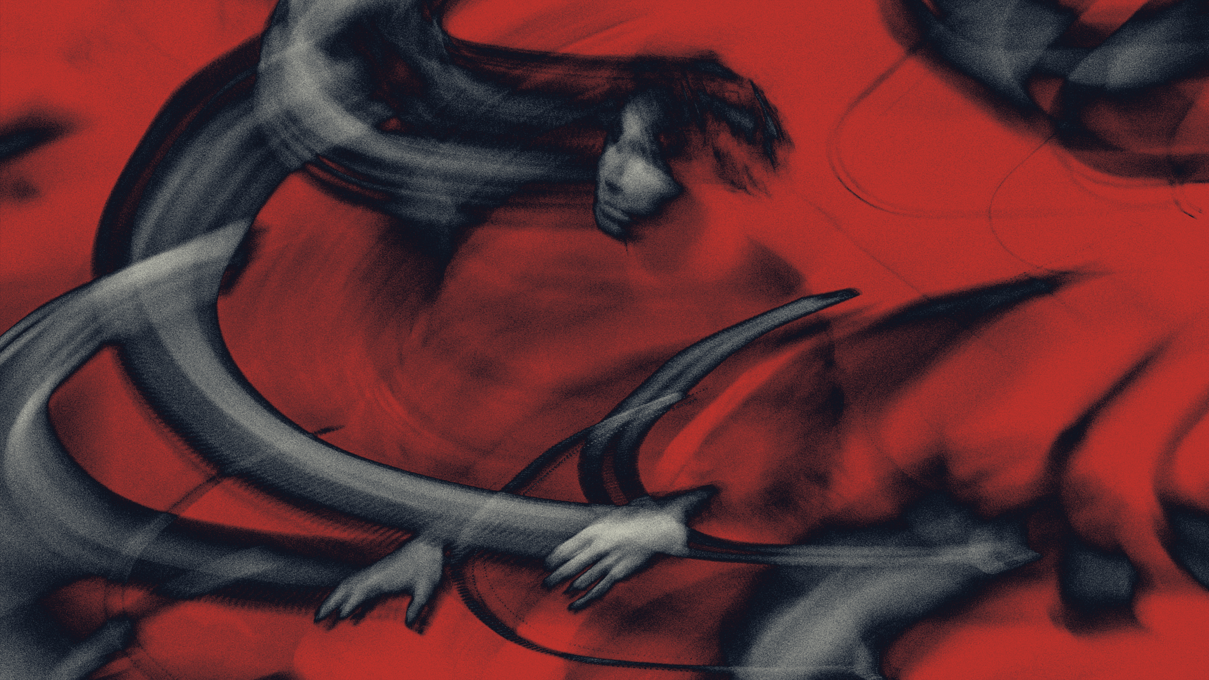
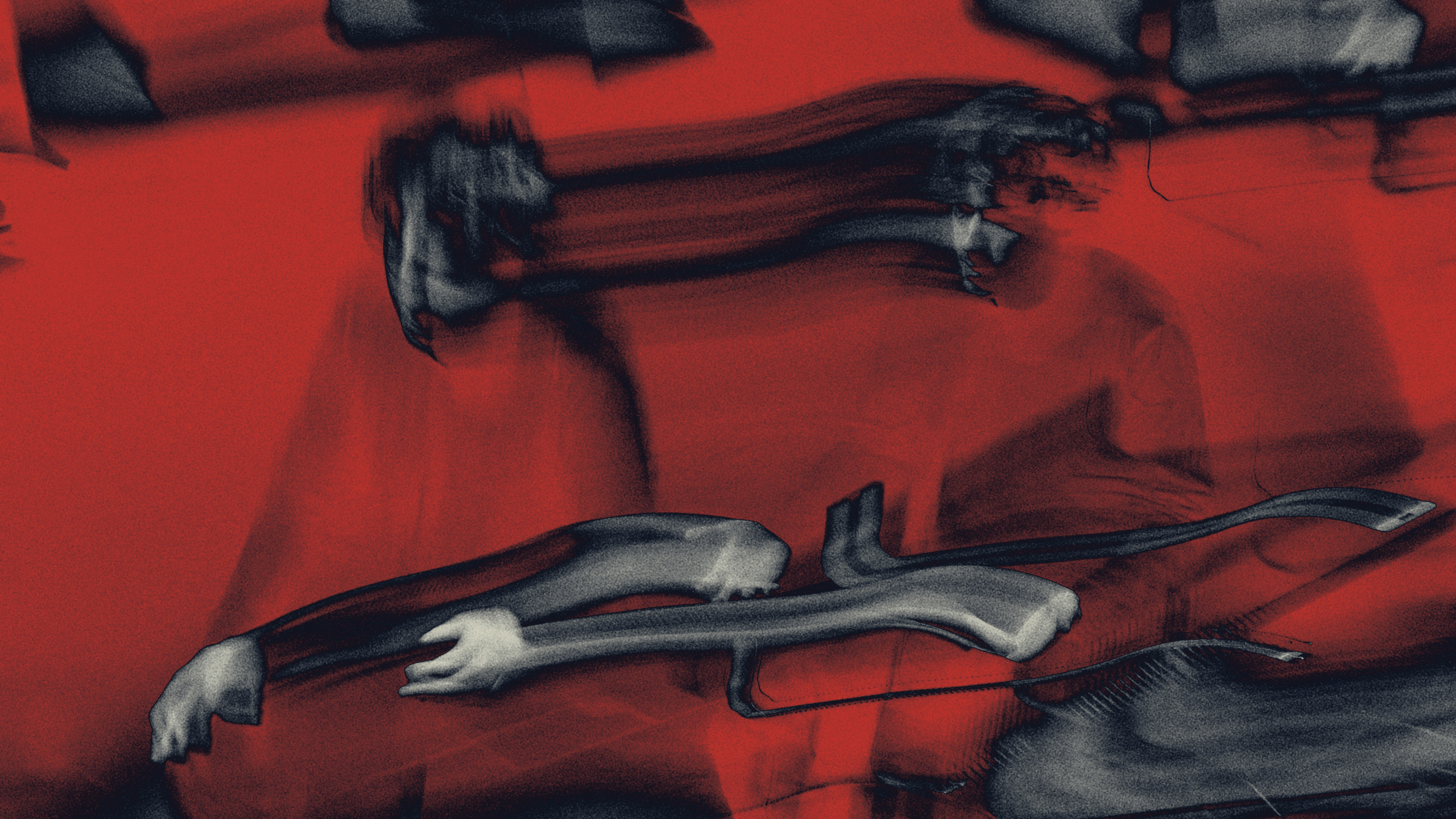
The creative direction centred on an experimental image-making process using layered and reprocessed motion. Video was repeatedly composited, enlarged and resampled to create dense, shifting textures that could move fluidly between still and animated applications. The resulting visual language gave the campaign a distinctive sense of depth, energy and unpredictability while remaining cohesive across every touchpoint.
The creative direction centred on an experimental image-making process using layered and reprocessed motion. Video was repeatedly composited, enlarged and resampled to create dense, shifting textures that could move fluidly between still and animated applications. The resulting visual language gave the campaign a distinctive sense of depth, energy and unpredictability while remaining cohesive across every touchpoint.
Key deliverables
Creative direction
Visual identity
Campaign design
Motion design
Social campaign
Vinyl artwork
Digital assets
OOH
Creative direction
Visual identity
Campaign design
Motion design
Social campaign
Vinyl artwork
Digital assets
OOH